
The Art of Almost Touching: Why Custom Embossed Stickers Create Depth Without Looking Loud
A cream envelope sits on a hallway table, and at first it looks blank. Then the afternoon light moves across the window, and a small crest rises out of the paper.
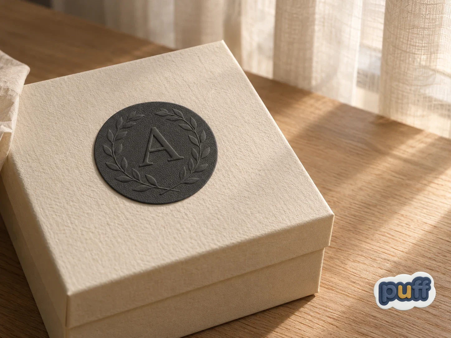
A cream envelope sits on a hallway table, and at first it looks blank. No logo, no return address, nothing printed on the flap. Then the afternoon light moves across the window, and a small crest rises out of the paper. A ring of leaves. A single letter in the middle. It was there all along, pressed into the paper without a drop of ink, waiting for the light to come around and find it.
You pick the envelope up and tilt it. The crest fades when you face it head-on and sharpens when you turn it toward the glass. Without thinking, your thumb goes looking for it. You find the edge of a leaf, the curve of the letter, the place where the paper lifts and then settles again.
That small moment holds something most design never reaches. The crest did not shout. It did not use color or size or a bold typeface to get your attention. It used a few fractions of a millimetre and the angle of the sun, and it still made you stop, lean in, and touch.
This is the quiet power of embossing. Most raised surfaces announce themselves. A puffy sticker swells up and invites a squeeze. An epoxy dome catches the light like a drop of water. Embossing does something gentler. It gives the eye just enough depth to wonder about, and then it lets you close the distance yourself. It works in the space between seeing and touching, the space where you almost reach out before you do.
That space is what this piece is about. Custom embossed stickers create depth without looking loud because their depth is not built into the surface alone. It is borrowed. Borrowed from the light in the room, from the shadow along a raised edge, and from the attention of the person holding them. Once you see embossing this way, as a design the world finishes for you, a lot of things about it start to make sense: why it feels expensive without trying, why it rewards a second look, and why it can feel more personal than a print twice its size.
A Design Drawn in Shadow
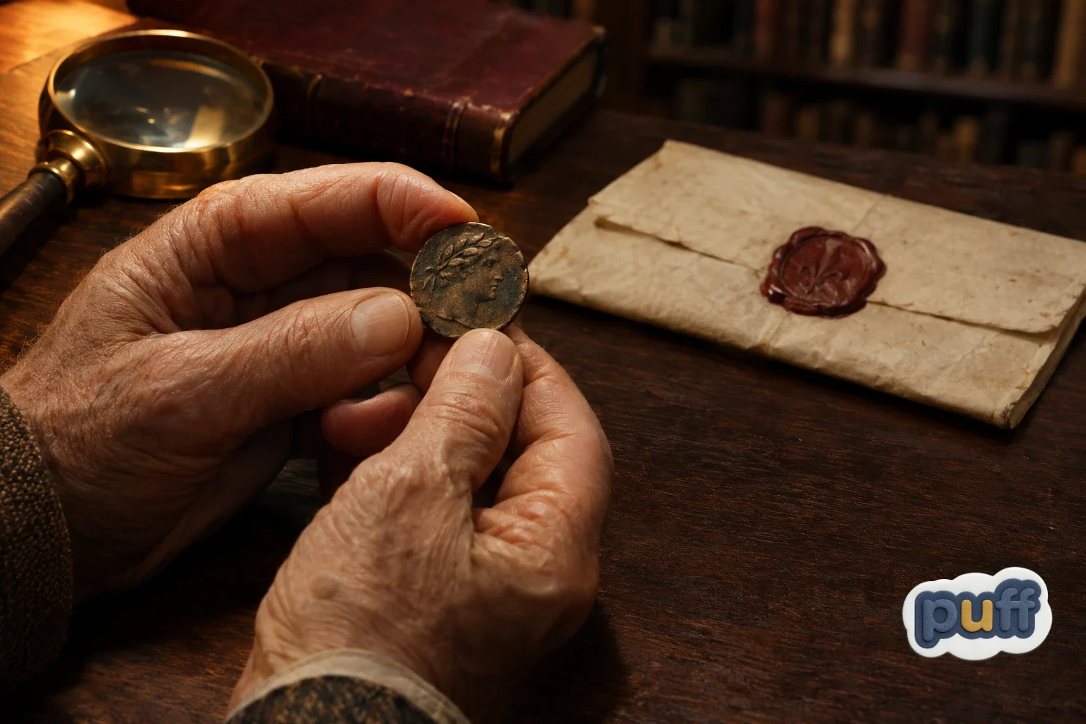
Hold an old coin up to a lamp and turn it a little at a time. The face on it sits only a sliver higher than the background, yet you can read a nose, a jawline, the curl of a laurel wreath. Tilt it again and the face nearly disappears into a flat disc of metal. The coin has no ink. Everything you see on it is light falling on a slope and shadow pooling in a dip.
People have made pictures this way for thousands of years. Before printing, before paper was cheap, the raised image was how a person or a city left a mark. Wax seals closed letters and proved who sent them. Signet rings pressed a family's sign into soft clay. Coins carried the faces of rulers across whole empires. Sculptors carved stories into temple walls in shallow layers, a craft art historians call relief, where figures rise from a background they never leave.
A seal did more than decorate. It promised that nobody had opened the letter, and it carried the sender into the hands of the reader. People trusted the raised mark because it was hard to fake and impossible to miss once you touched it. Some of that old trust still clings to raised designs today. A pressed crest feels official, considered, and a little ceremonial, even when we cannot say why.
One of the most beautiful versions of this craft came from Renaissance Florence. The sculptor Donatello developed a style later known as rilievo schiacciato, or "flattened relief." Some of his carvings sat only a few millimetres deep, yet they showed whole landscapes, crowds, and skies stretching far into the distance. He did not need deep cuts to suggest deep space. He let tiny changes in the stone catch the light, and the viewer's eye did the rest.
You can still see this idea at work in everyday objects that never call themselves art. The raised numbers on a row of elevator buttons, the maker's mark stamped into the base of a ceramic mug, the dimpled grip on a camera body. Each one carries a small piece of information in shape rather than in print, and each one changes a little as the light around it moves through the day.
That is the secret embossing still runs on. A raised design does not draw itself with ink. It draws itself with shadow. Every edge throws a thin line of darkness on one side and picks up a thin line of brightness on the other. Those two lines, light and dark, are what your brain reads as shape. Take the light away and the design goes quiet. Bring it back from the side and the design wakes up.
This gives embossing an odd and lovely quality: it never looks the same twice. A printed logo looks the same at noon and at midnight. An embossed one changes with the room. Morning light from a kitchen window makes it crisp. A warm lamp in the evening makes it soft. Under flat overhead light in an office, it can almost vanish, only to return the moment someone picks it up and tilts it.
Printers have a name for the purest form of this: blind embossing, where the design rises with no ink or foil at all, only shape. It is the cream envelope from the hallway table. It is the crest on a fine wedding invitation, the title pressed into a cloth book cover, the small logo you only notice on a business card when your fingers find it. Blind embossing proves that depth alone can carry a message, with nothing printed to help it.
So when we say embossed designs borrow their depth, this is what we mean. The surface supplies a slope. The world supplies the light. Your eyes and your hands supply the meaning. None of the three can do it alone, and that shared effort is part of why the result feels so alive.
Why the Quiet Version Pulls Us Closer
Think about the last time someone whispered to you across a table. You leaned in. You stopped whatever else you were doing. A whisper asks for closeness, and people give it without being asked twice. A shout makes you step back. A whisper makes you step forward.
Embossing works like a whisper for the eyes. A bright, high-contrast print hands you everything at once. You see it, you read it, you move on. A low, tone-on-tone embossed design holds something back. It gives you an outline, a hint of a shape, and a reason to look again. And when you look again, you look closer. Your head tilts. You bring the object nearer. Before you know it, your thumb is on it.
There is a real perceptual reason for this. Most of the time your brain guesses at the shape of things from small clues, and shading is one of the strongest of those clues. When the shading on a surface is faint, your brain cannot settle on a confident answer right away, so it asks for more information. Moving the object, shifting your head, reaching out to feel it: these are all ways of gathering that information. Embossing sets off this small search on purpose. It creates a puzzle mild enough to be pleasant and easy enough to solve in a second.
This sits close to the line where a sticker stops feeling flat and starts feeling raised. Puffy and domed stickers cross that line with room to spare. You never wonder whether they are raised. Embossing lives just past it, close enough to the edge that you have to check. That little moment of checking is the whole experience. It is the art of almost touching.
You can watch this happen in any museum that keeps old coins or medals under glass. People walk past the paintings at a steady pace, but at the coin cases they slow down and bend. They shift from side to side, chasing the light across a face no bigger than a fingernail. Nothing in the case is bright. Nothing is large. The objects hold attention because they make the viewer move, and moving to see something turns looking into a kind of conversation.
People who study the senses have spent years showing how much the eye borrows from the hand. Charles Spence, who leads the Crossmodal Research Laboratory at the University of Oxford, has explored how what we see and what we feel shape each other, so that the look of a surface colors our sense of its texture and quality. Embossing leans on this link harder than most finishes. With so little to see, the eye starts to feel on the hand's behalf. You run your gaze along a raised edge the way you would run a fingertip, and in that moment looking and touching blur into one act.
Then something else happens, and it matters more than the touch itself. You suspected the logo was raised, so you went looking. Because you did the looking, the find feels like yours. A design you had to work a little to notice turns into a small discovery, and people hold on to their discoveries in a way they rarely hold on to things handed to them.
This is the part loud design often misses. Volume does get attention, but it gets the kind of attention that fades fast. A neon sign is easy to see and easy to forget. A quiet detail asks for a different kind of attention, slower and more personal, the kind you give to something you have chosen to look at. Embossing earns that second kind. It does not compete for your eyes. It waits for them.
The Edge Decides the Voice
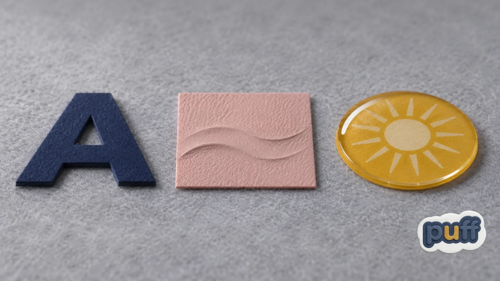
Run your finger along three raised surfaces and you will feel three personalities. The cut edge of a thick cardboard letter drops off like a step. A carved wooden sign slopes down into its background. A drop of resin on a dome label swells up and rolls away in a smooth curve. All three can stand at the same height. They still say very different things.
Height gets most of the attention when people talk about dimensional stickers, and it does matter. The thickness of a sticker carries its own personality, from the calm confidence of a thin layer to the warm playfulness of full foam. But height is only half the story. The other half happens at the edge, where the raised part meets the flat part. That edge decides how the light behaves, and the light decides the voice.
It helps to think of three kinds of edges.
The first is the cliff. The surface rises straight up and drops straight down, with a sharp corner at the top. Light hits a cliff edge and makes a hard, thin shadow, like a pencil line. Cliff edges look cut-out and graphic. They feel crisp and a little bold, and they read as something placed on top of the surface rather than part of it.
The second is the slope. The surface rises at an angle, so the light changes bit by bit as it moves across the edge. Instead of one hard line, you get a soft ramp from bright to dark. Slopes look carved or pressed. They feel like they belong to the material, as if the shape grew up from inside it. This is where most embossing lives.
The third is the swell. The surface curves up and over in a rounded bulge, like a dome or a pillow. Light slides across a swell and leaves a soft highlight on top. Swells look full and soft. They belong to puffy foam and epoxy, the louder and more playful members of the family.
Most real designs mix these edges, and the mix gives them much of their character. A crest might use slopes for its outer ring and a cliff for a single sharp letter in the middle, so the eye lands there first. Once you start noticing edges, you see them everywhere: on the buttons of a coat, the keys of a laptop, the rim of a coffee cup. Each one tells your eye something about how it was made and how it wants to be held.
Seen this way, the quiet quality of embossing makes sense. Embossed designs often sit lower than other raised finishes, but height is not the main reason they feel calm. They speak through slopes. A slope does not draw a hard line around a shape. It shades the shape into its surroundings, the way a pencil drawing shades a cheek. The design looks connected to the surface, not stuck on top of it. That connection is what feels refined.
Color plays along with this. Embossing often appears tone-on-tone: a black logo raised from a black background, cream on cream, deep green on deep green. With no color contrast to lean on, the shape has to do all the talking, and slopes are good at quiet talking. The same thinking runs through the appeal of soft, low-shine finishes. As we explored in The Psychology of Quiet Surfaces, a matte surface can feel calmer and more grown-up than a glossy one because it does not throw reflections back at you. Embossing on a matte background doubles that calm. The surface does not glare, and the design does not shout.
This also explains why quiet luxury so often reaches for embossing. A designer handbag with a small pressed logo near the clasp. A fountain pen box with the maker's name sunk into the lid. A bottle of good olive oil with a raised crest on a plain label. None of these need to be loud, because loudness is not the message. The message is care. Someone took the time to shape this surface, not just print on it.
Where Embossing Earns Its Place
Picture a small candle shop at the end of a quiet street. The jars are plain glass, the wax is pale, and every lid carries the same round label: a soft grey circle with the shop's name raised in the middle. Nothing about the label is bright. Yet people pick the jars up, turn them in their hands, and run a thumb across the lid before they even smell the wax.
That is embossing doing what it does best. It fits wherever the product itself is calm, careful, or made to last. Skincare jars, notebooks and journals, leather goods, wine and spirits, tea tins, jewelry boxes, small-batch coffee, handmade soap. These are things people hold, keep, and come back to. A design that rewards a slow look matches a product that wants a slow use.
PU embossed stickers bring this effect to places where paper embossing cannot reach. Instead of pressing a shape into paper with a metal die, they build the raised design into a structured, multi-layer surface, which gives them a leather-like feel and a quiet premium effect that suits glass, tins, card, and gift boxes alike. That means the cream-envelope moment can live on a candle lid, a journal cover, or the front of a box.
Embossing also ages in a way that suits these kinds of products. Think of the face on an old coin, worn smooth where thumbs have rubbed it for decades, or the pressed logo on a leather wallet that softens a little each year. A raised mark carries the history of the hands that held it. That is what a favourite journal or a well-loved tin should do.
A few simple ideas help an embossed design do its job well.
Let one thing rise. Embossing is strongest when it has a clear star. A single logo, a crest, or a short name raised from a flat field will feel calm and confident. Raise everything, and the eye no longer knows where to rest. The whisper turns into a crowded room of whispers.
Keep the shapes generous. Fine lines and tiny letters are hard to read in shadow alone. A raised design needs a little width to catch the light, so bold marks and simple outlines tend to work better than thin script or small print.
Trust tone-on-tone. Leaving out color contrast can feel risky, but this is where embossing shines. When the shape carries the design on its own, people look longer. If the brand needs a hint of color, a single accent tends to sit better than a full palette.
Check it in side light. Before signing off on a design, hold a sample near a window or turn a desk lamp so it falls across the surface at a low angle. That is how the design will come alive in real life. Head-on light flattens embossing. Side light is where it sings.
Think about where the thumb will land. Embossing invites touch, so place the raised element where a hand goes without thinking: the centre of a lid, the front of a box, the spot a person grips when lifting a jar. The design then becomes part of how the product is handled, not just how it looks.

The Business of Being Found
A woman opens a gift box at her kitchen table. The tissue paper comes away, the product inside is lovely, and then, as she lifts the lid to set it aside, her fingers brush something on the underside. A small raised logo. She had not noticed it. She turns the lid toward the light and smiles a little, the way people smile at a note tucked inside a borrowed book.
That smile is worth a lot, and loud design struggles to buy it. Most branding works by being seen. Embossing often works by being found. And something found feels different from something shown. When a person discovers a detail on their own, the moment belongs to them. Nobody pushed it at them. They earned it, in a tiny way, by looking closely.
For a small brand, that difference matters. People pass logos all day, and most of them slide by without leaving a trace. A quiet raised mark asks for nothing, yet people remember it, because it was part of a small personal experience rather than one more message in a long line of messages. It tells the customer that someone thought about the parts of the product they might never even see.
There is also the matter of the second meeting. A bright label does most of its work the first time someone sees it. An embossed label keeps working. The customer notices it on the shelf, notices it again when they unpack it at home, and finds it once more under their thumb a week later. Each small meeting adds a little familiarity, and familiarity, over time, turns into fondness. The brand stops being a name on a package and starts being a texture someone knows.
There is a kind of trust in this too. Loud packaging can feel like it is trying to convince you. Quiet packaging feels like it already believes in itself. An embossed label says, without words, that the product does not need to shout to be good. Customers tend to hear that, even when they could not put it into words.
None of this means every brand should go quiet. A festival wristband, a kids' snack, a skate brand: these may want energy, color, and swell. Embossing is not better than louder finishes. It is a different tool for a different feeling. The trick is to match the voice of the surface to the voice of the thing it sits on.
The Depth We Bring With Us
Go back to the cream envelope on the hallway table. When the light leaves the window and the room turns blue with evening, the crest disappears again. The paper looks blank. But you know it is there now. You have felt it. Even in the dark, your thumb could find it.
That is the part of embossing that is easy to overlook. Its depth never lived in the paper alone. It lived in the meeting of three things: a gentle slope, a moving light, and a person willing to lean in. Take away any one of them and the design goes silent. Bring them together and a few fractions of a millimetre become a crest, a name, a small object with a presence of its own.
Most design tries to close the distance between itself and the viewer as fast as it can. Embossing leaves a little gap on purpose. It shows you just enough to make you curious and then waits for you to cross the rest of the way. In that short space between seeing and touching, something quiet happens. Attention turns into care. A surface becomes a thing you know by feel.
Picture the envelope one more time, years from now, tucked in a drawer with old letters. Someone finds it, holds it up to a window out of habit, and the crest rises again, as if it had been waiting for them.
That is the real art of almost touching. Not depth that pushes out toward you, but depth that draws you in. Loud design reaches for you. Quiet design lets you reach for it, and what we reach for, we tend to keep.