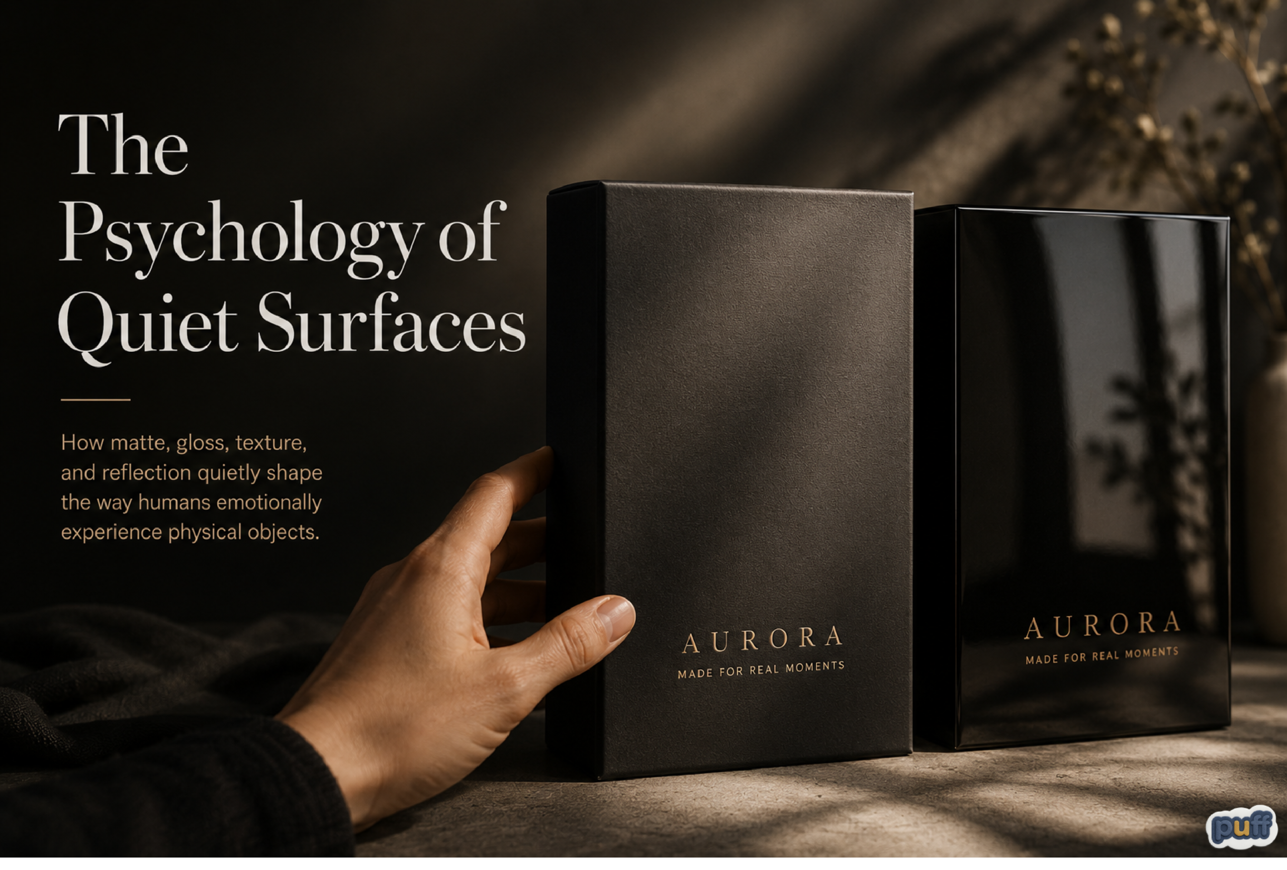
How matte, gloss, texture, and reflection quietly shape the way humans emotionally experience physical objects.
There are some surfaces that speak immediately.
You notice them from across the room. They flash under lighting. They bounce reflections into your eyes before you even fully register what the object is. They feel fast. Active. Restless.
And then there are quieter surfaces.
They do not compete for attention in the same way. They absorb more light instead of throwing it back outward. They feel softer visually, even before touch happens. Sometimes they almost disappear at first glance.
Yet strangely, people often stay with them longer.
Most people describe this difference as matte versus gloss. But emotionally, it goes much deeper than finishes alone.
What we are really reacting to is the psychology of surfaces themselves.
Most conversations about packaging finishes stop at technical language. Gloss reflects more light. Matte diffuses it. Gloss appears vibrant. Matte appears subdued.
All of that is true.
But none of it fully explains why these surfaces create such different emotional reactions in people.
Because surfaces are not only visual experiences.
They are psychological environments.
The way a material handles light changes the pace at which people experience an object. It changes whether a product feels loud or calm. Temporary or lasting. Playful or restrained. Immediate or thoughtful.
Humans feel these things instinctively long before they explain them logically.
A person running their fingers across a matte label. A child staring at a holographic sticker moving under sunlight. Someone picking up soft-touch packaging and unconsciously holding it for an extra few seconds.
These reactions happen before language.
Before analysis.
Before conscious decision-making.
And in a world increasingly filled with bright screens, moving advertisements, glossy interfaces, and visual overstimulation, quieter surfaces are beginning to feel emotionally different in ways many brands are only starting to understand.
Not boring. Not weaker.
Just calmer.
Gloss Behaves Like Movement

Glossy materials constantly interact with changing light, creating movement, excitement, and attention-grabbing visual energy.
Glossy surfaces rarely sit still emotionally.
Even when the object itself is stationary, reflection creates constant movement across the material. Light slides over it. Shadows shift. Colors sharpen and intensify. The environment continuously changes the appearance of the surface.
The object feels active without physically moving.
Humans are naturally sensitive to this behavior because the brain evolved to notice changes in light instantly. Reflection has always signaled importance in nature. Water reflects light. Wet surfaces reflect light. Glass, polished stone, metal – reflective materials naturally attract attention.
Gloss taps directly into that instinct.
This is why glossy packaging often creates excitement quickly. It interrupts visual flow. It pulls attention aggressively and efficiently.
A glossy sticker sheet under store lighting feels energetic because the reflections constantly change while people move around it.
This effect becomes even stronger with holographic materials because shifting color and reflection create the feeling that the surface is constantly changing. The brain interprets this unpredictability as stimulation.
The object feels animated.
Children especially respond strongly to reflective materials because children interact with sensory environments more physically than adults do. Shine, movement, and color variation create curiosity almost immediately.
This is why holographic stickers, glossy toy packaging, metallic wrappers, shiny sports branding, and epoxy dome stickers often feel exciting at first glance.
The surface creates visual speed.
And in many situations, that energy works beautifully.
Matte Slows the Experience Down

Matte surfaces absorb more light and reduce visual noise, creating a slower and more comfortable interaction with physical objects.
Matte surfaces behave differently.
Instead of reflecting the environment aggressively, they soften it. They reduce visual interruption. The object begins feeling more stable and controlled because light no longer moves dramatically across the surface.
The experience slows down.
A matte object often feels quieter not because it lacks personality, but because it removes visual pressure.
That emotional shift is subtle but powerful.
Modern life is already filled with reflective noise: phone screens, notifications, glossy interfaces, bright advertisements, moving video, LED lighting, and polished digital environments.
People spend enormous amounts of time inside visually loud spaces.
And because of that, quieter physical experiences have started feeling emotionally valuable.
This may explain why matte packaging increasingly feels premium today. Not because matte is inherently luxurious, but because calmness itself has become desirable.
Gloss often demands attention immediately.
Matte allows attention to settle naturally.
That difference changes how people emotionally relate to objects.
Quiet Surfaces Create Emotional Space
One of the most interesting things about matte materials is that they create space around an object.
Gloss projects outward. Matte pulls inward.
A highly reflective package interacts aggressively with its environment. It throws light outward constantly. Matte surfaces absorb more of the environment instead of competing with it.
This changes emotional atmosphere.
Some packaging feels crowded even when the design itself is simple. Too much reflection creates tension because the eye never fully rests.
Matte surfaces reduce that tension.
They feel composed.
Sometimes almost private.
A matte notebook on a desk feels different from a glossy notebook even if both use identical typography and color. The matte version often feels more personal, more thoughtful, more grounded physically.
People may not consciously analyze this difference, but they absolutely feel it.
Surfaces communicate emotional behavior silently.
Why Luxury Brands Often Reduce Reflection
There was a period when shine strongly represented quality.
Gloss once signaled technological advancement, precision, freshness, and expense. Highly reflective packaging looked modern because it was difficult to manufacture consistently at high quality.
And in some industries, gloss still communicates exactly that.
But many luxury brands slowly moved in another direction.
They softened surfaces. Reduced glare. Added texture. Introduced matte coatings. Used restrained reflection instead of constant shine.
Fashion brands. Premium skincare. Boutique coffee packaging. Minimalist technology companies. High-end fragrance packaging.
Many of these categories discovered that quietness itself can feel expensive.
Because humans often associate restraint with confidence.
A brand that constantly screams for attention can sometimes feel insecure. A quieter presentation often feels more deliberate.
Matte packaging says: We do not need to overwhelm you.
That emotional restraint matters.
Especially today, when consumers are exhausted by overstimulation.
Why Quiet Surfaces Feel More Human

People often connect more deeply with materials that feel physically real, textured, and naturally touchable.
Humans naturally trust materials that feel physically believable.
Matte textures often feel warmer, softer, and emotionally closer than aggressive shine. Perfect reflective surfaces can sometimes feel distant or overly manufactured, especially when combined with excessive smoothness and visual polish.
Quiet surfaces behave differently.
They interact with fingerprints, shadows, texture, and light in softer ways. Edges feel less sharp. Materials feel less artificial. The object begins feeling physically present instead of visually optimized.
That distinction matters more than most brands realize.
People do not only respond to graphics. They respond to material behavior.
This is one reason textured matte finishes, soft-touch laminations, embossed packaging, fabric-inspired materials, and even textured PU stickers often feel emotionally richer than completely glossy flat surfaces. The brain interprets them as objects instead of images.
And humans naturally connect more deeply with objects that feel physically real.
Soft-touch packaging especially creates an interesting emotional effect because it changes touch expectations before touch even happens. A softer visual texture quietly suggests warmth, calmness, and physical comfort.
People often slow down when interacting with these materials.
They hold the object longer.
They run their fingers across the surface unconsciously.
They become more physically aware of the packaging itself.
That reaction is deeply instinctive.
In many ways, quiet surfaces feel more human because they reduce visual performance and increase physical presence.
The object no longer feels like it is demanding attention.
It simply feels present.
Matte Feels Closer to Material
Glossy surfaces sometimes feel image-based.
Matte surfaces often feel material-based.
This is a subtle but important psychological distinction.
Highly glossy packaging can occasionally feel distant because reflection dominates the surface itself. The eye notices shine first. Texture becomes secondary.
Matte reverses that relationship.
Instead of emphasizing reflection, matte surfaces allow people to notice texture, edges, grain, softness, and small physical details more clearly. The material itself becomes more visible.
Gloss often makes people notice reflection first.
Matte makes people notice material first.
That difference quietly changes how physical objects are emotionally interpreted.
A matte surface can sometimes feel more honest simply because it reveals more of the material underneath instead of covering it in visual performance.
This is one reason textured matte labels, embossed surfaces, soft-touch laminations, PU materials, and fabric-inspired finishes often feel more grounded physically than completely smooth glossy prints.
The brain interprets these surfaces less like graphics and more like objects with physical presence.
And humans naturally trust believable materials more than artificial perfection.
The Rise of Soft-Touch Packaging
Soft-touch matte finishes introduced an entirely new emotional layer to packaging.
Not only did these surfaces reduce reflection visually, but they also changed physical interaction completely.
People touch soft-touch packaging differently.
They slow down.
They apply more pressure with their fingertips. They hold the object longer. They rub the surface unconsciously.
This is because the finish creates warmth psychologically.
Even when the material temperature remains unchanged, softer tactile textures feel emotionally warmer to humans than slick glossy surfaces.
That reaction is deeply instinctive.
Humans are texture-sensitive creatures. Touch affects trust more than most people realize. Materials that feel calm physically often create calmer emotional associations as well.
This is partly why soft-touch luxury packaging became so influential. The experience no longer relied only on appearance.
The packaging became sensory.
Why Gloss Still Matters Emotionally
None of this means gloss is inferior.
That would completely misunderstand the emotional role reflective surfaces play.
Gloss can feel joyful.
Energetic. Expressive. Bold. Playful. Fresh.
A glossy sticker on a skateboard feels right. A holographic logo on festival merchandise feels alive. A smooth epoxy dome label feels satisfying precisely because of the way it catches light.
Reflection creates excitement.
And certain products absolutely benefit from that emotional energy.
Food packaging often uses gloss because reflection psychologically enhances freshness and intensity. Sports branding frequently uses reflective finishes because movement and energy are central to the identity.
Children’s products especially respond beautifully to gloss because children naturally seek sensory stimulation through movement, light, and color variation.
The issue is not shine itself.
The issue is visual overload.
When every surface screams simultaneously, reflection loses emotional impact.
Why Matte and Gloss Work Best Together
Interestingly, some of the most effective packaging combines both finishes instead of choosing only one.
A matte surface with selective gloss. Soft-touch packaging with foil details. Muted labels with reflective embossing.
Contrast creates emotional rhythm.
When everything reflects, nothing feels special anymore.
But when a quiet matte surface suddenly catches a sharp line of foil under lighting, the effect becomes stronger because the surrounding material remains calm.
This is part of the reason foil stickers often feel more valuable when paired with softer matte surfaces instead of overwhelming reflective backgrounds.
Luxury packaging understands this instinctively.
Silence amplifies sound. Darkness amplifies light. Matte amplifies gloss.
The contrast feels intentional.
Controlled.
The Emotional Psychology of Quiet Luxury

Quiet luxury often relies on texture, subtle details, and restrained reflection rather than visual excess.
Over the past few years, an interesting cultural shift happened in design and fashion.
People began moving away from obvious luxury.
Large logos became less desirable in certain spaces. Minimal branding became more respected. Quiet luxury emerged as a broader emotional aesthetic.
This movement was not only about wealth.
It was about emotional exhaustion.
People became tired of visual competition.
And packaging quietly evolved alongside that shift.
Muted textures. Soft surfaces. Minimal reflection. Natural materials. Warm matte finishes.
These things started feeling emotionally intelligent rather than visually weak.
Because calmness itself became aspirational.
A quiet surface can sometimes feel more confident than an aggressively polished one.
Digital Fatigue Changed Physical Preferences
Much of this shift may be connected to digital fatigue.
Humans now spend enormous portions of life staring at glowing rectangles.
Bright screens dominate modern experience: phones, laptops, tablets, televisions, advertising displays, and digital signage.
Most of these surfaces are glossy because gloss enhances contrast and color intensity on screens.
But constant exposure to reflective brightness changes how people emotionally respond to physical objects.
Many people now crave experiences that feel physically softer.
Matte surfaces provide relief from digital sharpness.
A textured package on a desk feels fundamentally different from another glowing interface. Soft-touch labels feel emotionally grounding compared to polished glass screens.
This may partly explain why tactile branding is becoming more important again.
People miss physical presence.
Why Puffy Stickers Feel Emotionally Different

Puffy stickers create a unique emotional experience because they add physical depth, softness, and touchable texture. They feel less like printed graphics and more like small objects people can interact with.
This same sensory psychology also explains why puffy stickers continue growing in popularity despite increasingly digital lifestyles and screen-heavy environments.
Puffy stickers interrupt flatness physically.
They create softness and depth instead of only visual graphics. The raised surface changes how fingers interact with the object. Light behaves differently across curved edges. The sticker feels more like a tiny object than a printed surface.
Puffy stickers create a kind of soft depth that flat printed surfaces rarely achieve, even when the graphics themselves are visually similar.
That distinction matters emotionally.
Humans remember tactile experiences strongly.
Children especially develop emotional attachments to objects through texture and dimensionality. A puffy sticker feels playful because the experience becomes physical instead of purely visual.
People increasingly respond to emotionally satisfying textures that feel calming and physically interactive instead of visually overwhelming.
Some of this emotional attachment may also connect to a broader feeling of sticky nostalgia tied to tactile childhood experiences and collectible culture.
This is also why embossed labels, epoxy stickers, and raised packaging elements often feel more memorable than flat printing alone.
The brain responds strongly to physical interruption.
Surfaces Influence Trust
One overlooked aspect of material psychology is trust.
Humans unconsciously judge product credibility through surface behavior constantly.
Cheap glossy finishes often reflect unevenly. Poor laminations peel awkwardly. Overly slick surfaces sometimes feel disposable.
Meanwhile, controlled matte finishes often feel intentional and composed.
Of course, matte alone does not automatically create quality. Poor matte materials can still feel cheap.
But emotionally, humans tend to associate controlled texture, restrained reflection, and balanced tactile feedback with greater care and thoughtfulness.
The material feels considered.
And considered objects often feel more trustworthy.
Quiet Surfaces Stay Longer in Memory
Interestingly, the loudest object is not always the most memorable one.
Sometimes the opposite happens.
Certain experiences remain emotionally because they felt calm during moments of overstimulation.
A softly textured notebook. A matte fragrance box. A quiet cafe. A warm fabric label. A muted package sitting among reflective competitors.
The brain notices emotional contrast.
And today, calmness itself has become contrast.
This is why matte packaging often stands out more than expected in crowded retail spaces despite technically reflecting less light.
It interrupts visual aggression.
Not through brightness.
Through relief.
Packaging Is Becoming More Human Again

As digital experiences become more dominant, people increasingly seek products and packaging that feel tangible, textured, and emotionally grounded.
For years, design moved toward perfection.
Everything became sharper. Cleaner. Smoother. More polished.
But humans eventually began craving texture again.
Not necessarily consciously. But emotionally.
Record players returned. Textured papers returned. Fabric labels returned. Embossing returned. Puffy stickers returned. Soft-touch materials returned.
People missed surfaces that felt physically believable.
Modern branding is slowly becoming more focused on sensory packaging experiences rather than visual appearance alone.
And this is perhaps the deeper reason quiet surfaces feel different today.
Not because matte is trendy.
But because humans are increasingly searching for experiences that feel grounded in a world that rarely slows down anymore.
Gloss still matters. Reflection still excites. Shine still creates joy.
But quiet surfaces offer something different.
A slower interaction. A softer emotional atmosphere. A calmer relationship between object and person.
And once people begin noticing that feeling, it becomes surprisingly difficult to ignore.