What a Kraft Look Actually Tells Us About a Package
Kraft brown packaging looks natural and honest, but the look and the material aren't always the same thing. Here's what a kraft finish can really promise.
Artwork, proofing & production
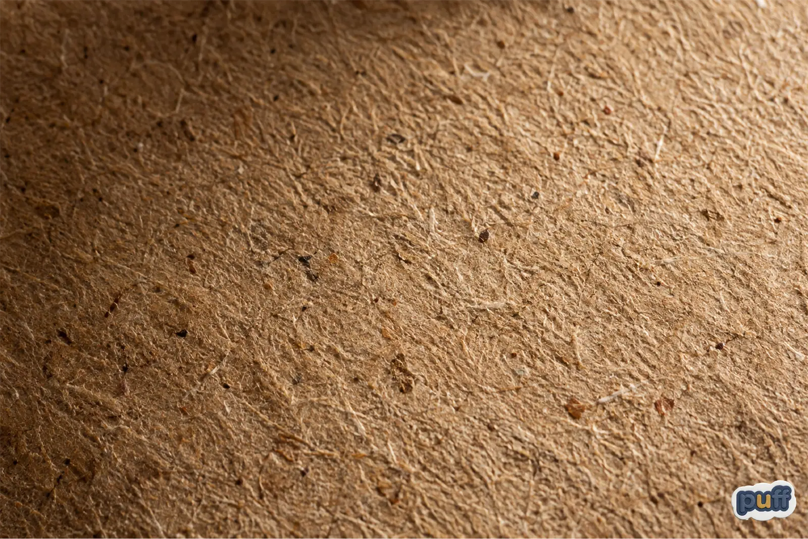
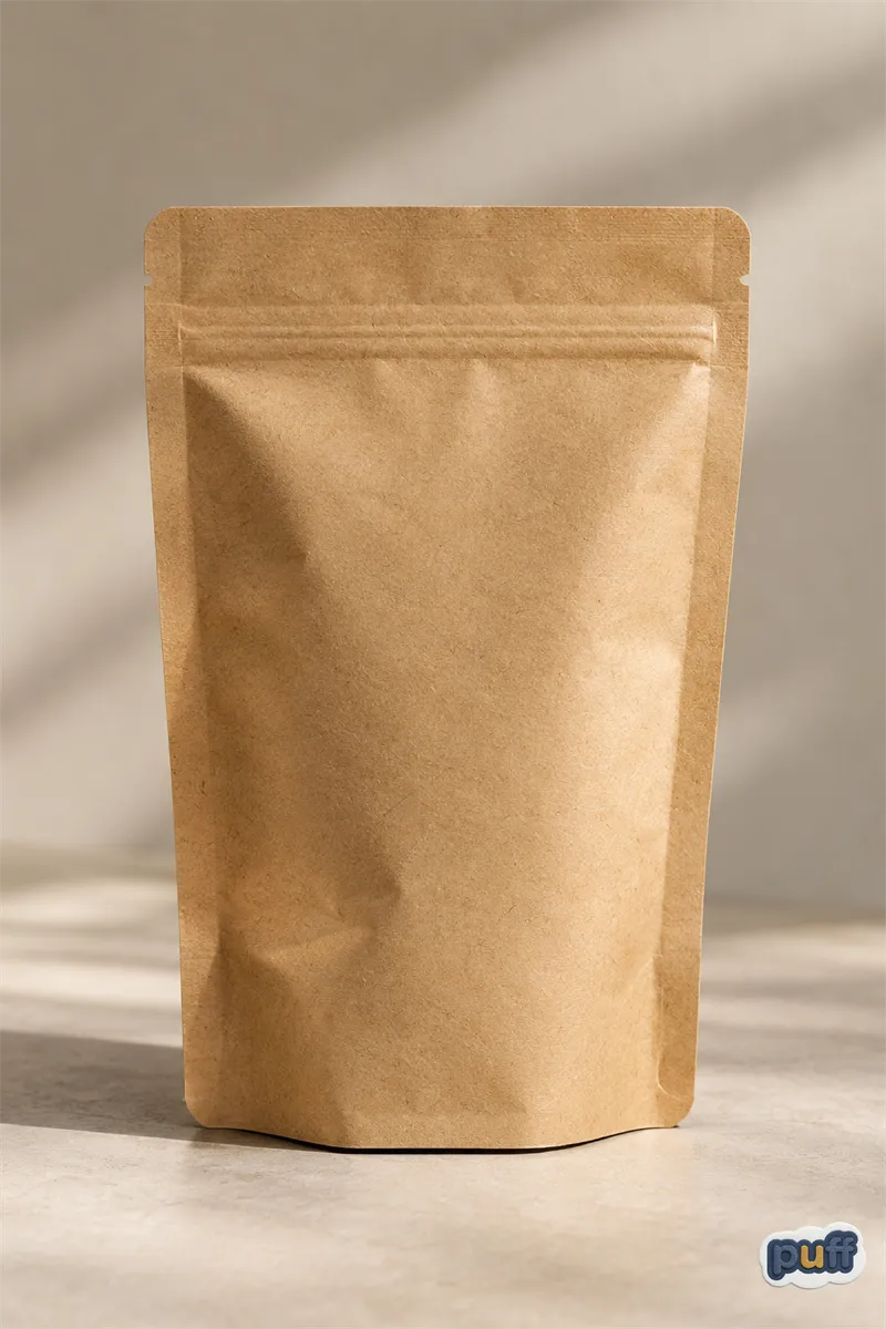
A shopper picks up a bag of coffee from a shelf. The color is a warm, dull brown. The surface has a slight tooth to it, no shine, faint flecks of fiber visible if you tilt it toward the light. Nobody on the label has said the word sustainable yet. The hand has already decided the bag is good.
That decision took under a second, and it happened before a single ingredient or claim got read. Something about the color and the texture did the convincing on its own.
The question worth asking isn't whether that instinct is wrong. It's what the instinct is actually tracking, and whether the thing it tracks still means what it used to.
A Color That Used to Mean Something Specific
Kraft paper gets its name from the German word for strength, not for its color. Chemists in the late nineteenth century worked out how to cook wood chips in a sulfate solution and pull out the longest cellulose fibers intact, and the result was paper that could hold weight other paper couldn't. The brown was never chosen. It's simply what unbleached wood pulp looks like once the lignin and tannins are still sitting in the fiber instead of stripped out with bleach.
For most of the twentieth century, that brown and that strength arrived together, because they came from the same process. A grocery sack, a shipping envelope, a roll of butcher paper. If it looked like kraft, it was kraft, because there was no other way to get that look.
There was also no reason to fake it. Kraft paper was the cheap, functional choice, not the aspirational one. A brand reached for it because it was sturdy and inexpensive, not because it communicated anything about the company's values. The idea that this particular brown could signal virtue came much later, once the raw, undyed look started to stand out against a retail landscape that had spent decades getting glossier, whiter, and more heavily printed.
The Look Outlives the Process
Somewhere along the way, packaging stopped needing the paper to get the look. Semiotics has a simple way of putting this: a sign is two things bolted together, an appearance and a meaning. For decades, kraft brown and kraft paper stayed bolted together so tightly that nobody thought to separate them.
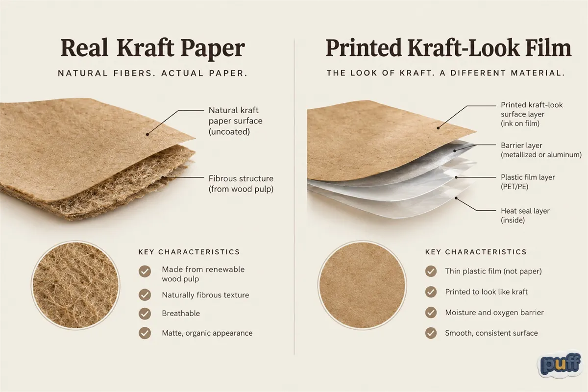
Then someone did. A printer can lay brown ink and a fiber-texture pattern onto bright white paper, or onto a plastic film that has never touched a pulp mill in its life. The look ships separately from the material now. A brand can buy the appearance of kraft paper on a laminate pouch, a coated box, a metallized bag, on anything a press can print.
That's not a scandal. Printing is an old, ordinary tool, and there's nothing dishonest about using ink to make a package pleasant to look at. But it does mean the brown on a package has stopped being evidence of anything by itself. It used to tell someone what the material was. Now it mostly tells them what the designer wanted them to assume, and those are two very different kinds of information wearing the same coat.
This is a familiar move in the history of design, not a new one. Wood-grain laminate did the same thing to furniture, and marble-print countertops do it now. A material develops a strong association through decades of honest use, and eventually the association becomes valuable enough to sell on its own, detached from the material that built it. Kraft brown is simply the packaging industry's version of the same trick, arriving at a moment when shoppers are actively looking for visual proof that a product respects the planet.
Why We Trust Brown Before We Read the Label
Run a thumb across a glossy label and then a matte one. The glossy one gives an impression of polish and control. The matte one, especially with a little visible grain, gives an impression of restraint, like the maker chose to leave something alone rather than dress it up.
Sensory marketing researchers, among them Aradhna Krishna at the University of Michigan, have spent years mapping how touch and visual texture shape a snap judgment before a shopper consciously weighs anything. Muted color, visible fiber, low shine: all of it points the same direction, toward unprocessed and restrained, closer to raw material than to industry.
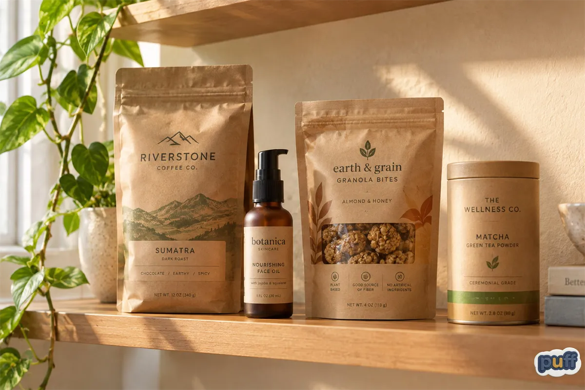
That's exactly why the kraft packaging aesthetic has spread so far past paper. Coffee, skincare, snack bars, even electronics now borrow the same tan tones and soft-fiber texture, because the impression forms fast and the impression flatters the product. A brand doesn't need an actual kraft manufacturing process to get the benefit, only the color and texture that used to come bundled with it. A single visible cue standing in for the whole picture is a familiar problem, one that shows up anywhere a material makes its case through appearance alone instead of through what's actually inside it.
None of this requires a shopper to be careless. It requires them to be efficient, which every shopper is, by necessity. Nobody has time to research the manufacturing process behind every product on a shelf, so the brain reaches for the fastest available proxy and treats it as good enough until something contradicts it. Color and texture are simply the fastest proxies available, faster than an ingredients list, faster than a certification logo, faster than the small print on the back panel that almost nobody turns a package over to read.
What the Look Can and Can't Promise
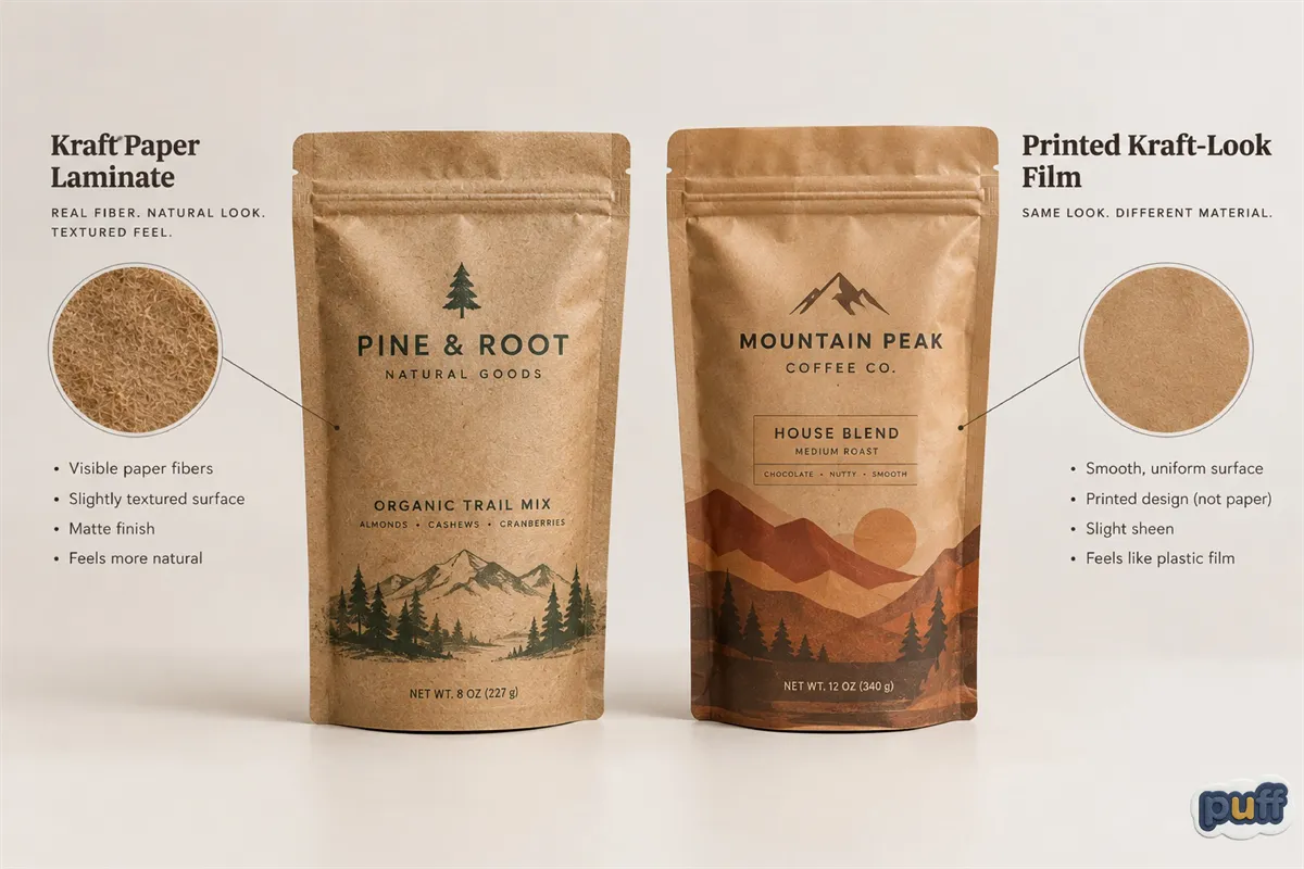
Pick up two brown pouches side by side. One is genuinely kraft paper laminated to a thin barrier layer. The other is an ordinary plastic pouch with brown ink printed on the outside and nothing kraft about its actual structure. Nothing in the hand tells them apart. The texture can be reproduced almost exactly.
This is where the color stops being useful as a shortcut. A package's real properties, what it's made from, whether it can be recycled, whether it will actually break down, live somewhere a glance can't reach. Seeing how a barrier film is actually built, layer by layer, is the only way to know what's really behind a finish like this.
The kraft packaging aesthetic, in other words, is a hypothesis about the material, not a certificate. It's worth taking seriously as a design choice, since someone picked it on purpose and that choice says something about who they're trying to reach, but not as a substitute for checking what's underneath.
None of this makes the look meaningless. A brand that reaches for kraft brown is still telling a buyer something true about its intentions, even in the cases where the material itself falls short of the promise. The gap worth watching for isn't between one brown pouch and another. It's between what a color makes someone feel and what a label, read closely, can actually back up.
When the Look and the Material Agree
Every so often, the appearance and the substance line up without a gap between them. That's worth noticing too, because it's rarer than the look's popularity would suggest.
A kraft mylar bag, done honestly, is exactly this kind of agreement. It puts a real kraft paper layer on the outside and keeps a genuine barrier film inside, built to actually block oxygen, moisture, and light, so its warm, natural look happens to be true rather than borrowed. Nothing about that combination is contradictory. A package can protect what's inside and still look like it came from a farm stand, as long as two different, honestly built layers handle the two jobs instead of one layer pretending to be both.
That's the real difference between a package that performs the kraft look and one that simply has it. The performance needs the color to work hard, because the color is covering for something. The honest version doesn't need to raise its voice, because it isn't hiding anything behind the tone.
There's a quieter business lesson in that gap, too. A look borrowed without the material to support it has a shelf life, because someone eventually checks, and the checking gets easier every year as buyers get more literate about packaging claims. A look built on a material that actually matches it doesn't carry that risk. It can hold up under exactly the kind of scrutiny it invites, which is the opposite of most marketing, where closer attention is usually the enemy.
The Brown That Means It
The shopper reaching for that coffee bag isn't wrong to notice the color. Color has always carried information, long before anyone thought to put it to work this deliberately.
What's changed is that the color and the material it once guaranteed can now travel separately, and only one of the two still tells the truth about what's inside. The brown on a package was never a promise by itself. It was a byproduct that got mistaken for one, repeated often enough that the mistake started to feel like a fact.
That's true of most visual shorthand, once you start looking for it. A color, a texture, a typeface, each one starts life as an accident of process or material, and each one eventually gets picked up and used on purpose, long after the original reason stopped applying. Kraft brown just happens to be a particularly clean example, because its origin is so easy to trace and its current spread is so wide.
Once a person notices that, the shelf looks a little different. Not less inviting, just more honest about what it's actually asking someone to believe.