
Softness Has a Shape: Why Custom Foam Stickers Feel Different Before We Even Touch Them
A child at a kitchen table points at the one sticker shaped like a pale blue cloud. She hasn't touched it yet. She already knows it's soft.
Artwork, proofing & production

A child is sitting at a kitchen table with a sheet of stickers. Most of them are flat and shiny, a row of cartoon stars and a smiling sun. One of them is different. It is a small cloud, pale blue, and it sits a little higher than the others, with edges that curve down to the paper like the rim of a loaf of bread. Before she peels anything, before she touches anything, she already knows which one she wants. She points at the cloud. When her mother asks why, she says, "Because it's soft."
She hasn't touched it yet. She knows anyway.
That small moment holds a question worth slowing down for: why foam stickers feel soft before anyone touches them. How do we know something is soft before our skin has a single thing to say about it? The answer is not a mystery of childhood or a trick of marketing. It is one of the most practiced skills the human eye has, and it runs so quietly that most of us never notice it working. Softness, it turns out, is something we see first and feel second. By the time a fingertip arrives, the brain has already written its guess. The touch that follows is less a discovery than a kind of checking in.
This is the lens for everything that follows: softness has a shape, and the eye reads that shape long before the hand confirms it.
Why Foam Stickers Feel Soft Before We Touch Them
Think about the soft things you knew earliest. A blanket that smelled like home. A stuffed rabbit with one ear worn thin. A pillow you pressed your face into on a sick day. None of these arrived with instructions. You learned what they were by holding them, squeezing them, falling asleep on them. Thousands of small experiences, most of them forgotten, taught you something you still use every day: what a soft thing looks like.
Over time, the eye took over much of the work the hand used to do. A grown adult walking into a room does not need to press every cushion to know which chair will be kind to their back. They glance, and they know. The rounded arm of a sofa, the slight sag in a seat, the way a throw pillow slumps against the frame. Each of these is a visual note, and the brain has read enough of them to fill in the rest of the sentence.
Culture leans on this skill all the time. Soft things stand in for comfort, safety, tenderness, and care. We say a person has a "soft side." We talk about a "soft landing" after a hard year. Baby products, bedtime stories, and hospital waiting rooms tend to reach for rounded forms and plush textures, because those shapes say something before anyone speaks. Softness has become a visual language of gentleness, and we are all fluent in it.
That fluency matters for small things too. A foam sticker is a tiny object, often no bigger than a coin, but it speaks the same language as the blanket and the rabbit and the cushion. When a raised, rounded sticker catches the eye, it pulls on a long chain of memories about what soft things have meant to us. The pull is quiet, and it is real.
There is also something personal in how people respond to it. Some of us reach for softness when we want to feel calm. Others reach for it when we want to feel playful or young again. A soft sticker on a laptop lid or the corner of a notebook can carry either mood, depending on who placed it there and why. In that sense, the sticker is less a decoration than a small signal about the kind of feeling its owner wants nearby.

How the Eye Guesses What the Hand Will Find
Here is where the story turns scientific, and where it gets more interesting than it first appears.
For a long time, people who study vision focused on questions like color, distance, and shape. How far away is that tree? Is that line straight or curved? A newer and quieter branch of research asks something closer to everyday life: how does the eye work out what things are made of? Is that surface wet or dry, sticky or smooth, hard or soft? The psychologist Roland Fleming and his lab at Justus Liebig University Giessen have spent years on this question, which researchers call material perception. The core finding is simple to say and hard to overstate. We are remarkably good at judging materials from images alone, and we do it fast, often in a fraction of a second.
We can do this because soft things behave differently in the world, and they leave visual traces of that behavior. A soft object bends under its own weight. It dents where something presses against it. Its edges round off instead of breaking into sharp corners. Light moves across it in a particular way. The eye picks up on these clues and turns them into a prediction: if I touched this, it would give.
This process is part of what scientists call multisensory integration, the brain's habit of blending information from different senses into one picture of the world. Sight and touch are not two separate reports filed in different offices. They feed into the same desk. When you look at a foam sticker, your brain is already drawing on everything it knows about how similar surfaces have felt against your fingers. Seeing and touching, in a very real sense, are working together before the hand moves at all.
It helps to picture the brain less as a camera and more as a forecaster. A camera records what is in front of it. A forecaster looks at the clouds, remembers a thousand past afternoons, and says there will be rain by four. The brain does something similar with materials. It takes in a few small clues, compares them with a lifetime of stored experience, and makes a call. Most of the time the call is right, which is why we rarely notice the forecasting at all. We only become aware of it on the odd occasion when the forecast fails, when the soft-looking thing turns out hard, or the solid-looking step turns out to wobble.
This forecasting also explains why softness can feel so immediate. There is no pause, no weighing of evidence. You look at a foam sticker and the softness is simply there, as plain as its color. That ease is the sign of a skill so well practiced it has stopped feeling like a skill.
Earlier on this blog, we looked at the reflex to touch a raised surface, that small pull a person feels to reach out and press something that stands up from a flat plane. This piece sits one step before that moment. The reflex tells us we want to touch. The prediction tells us what we expect to find. And the expectation is where softness first lives.
The Three Quiet Signals of Softness
If you look closely at a well-made foam sticker, you can find three visual signals doing most of the work. None of them shouts. Each one is small enough to miss. Together they tell the eye a complete story.
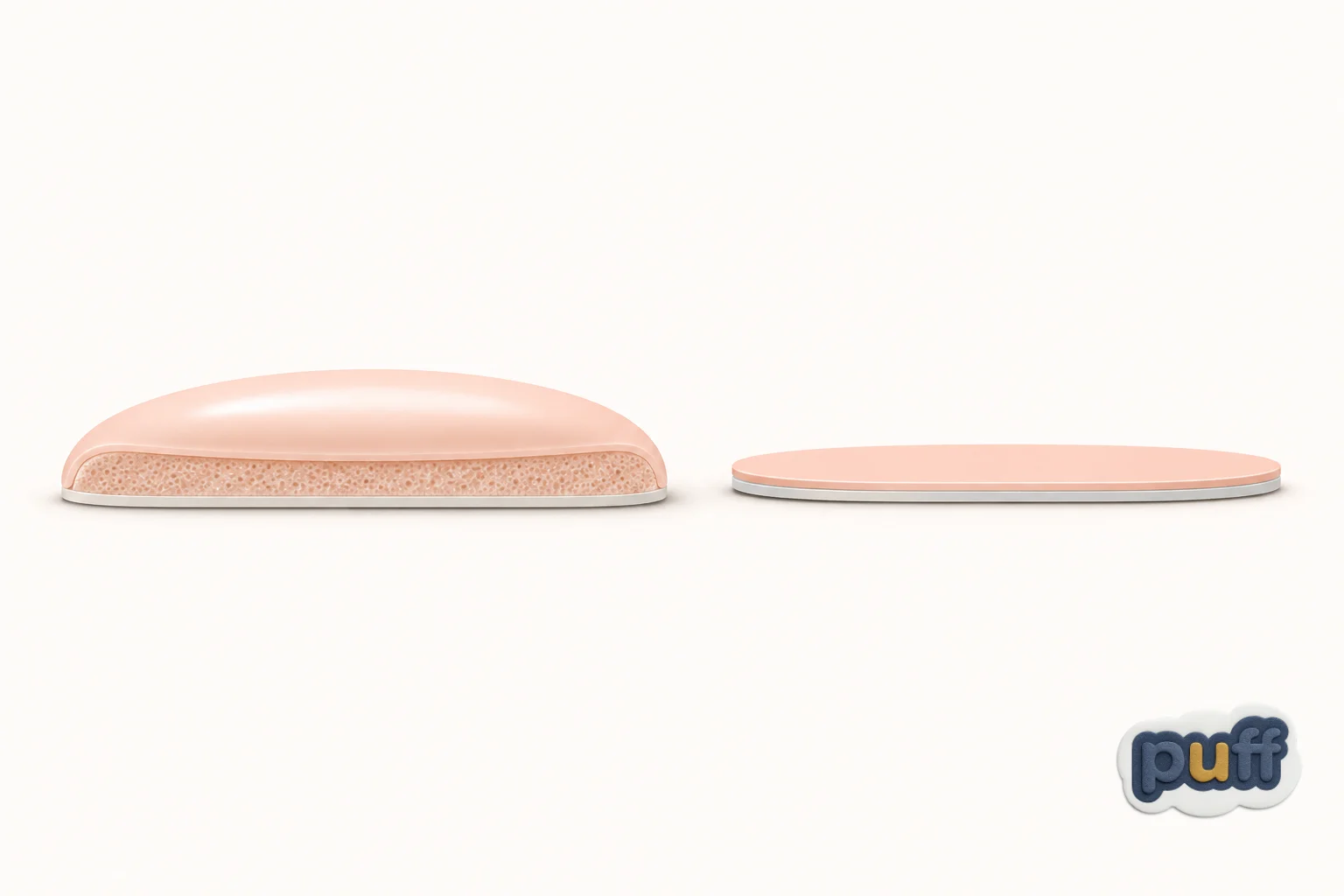
The first is the rounded shoulder. Look at the edge where a foam sticker meets whatever it is stuck to. A hard object tends to end in a crisp line, like the edge of a coin or a tile. A soft object curves down to meet the surface, the way a pillow's edge rolls toward the mattress. That curve is one of the strongest cues the eye has. It suggests the material could not hold a sharp corner even if it tried. When the shoulder of a sticker rolls gently down instead of stopping abruptly, the brain files it under "soft" almost at once.
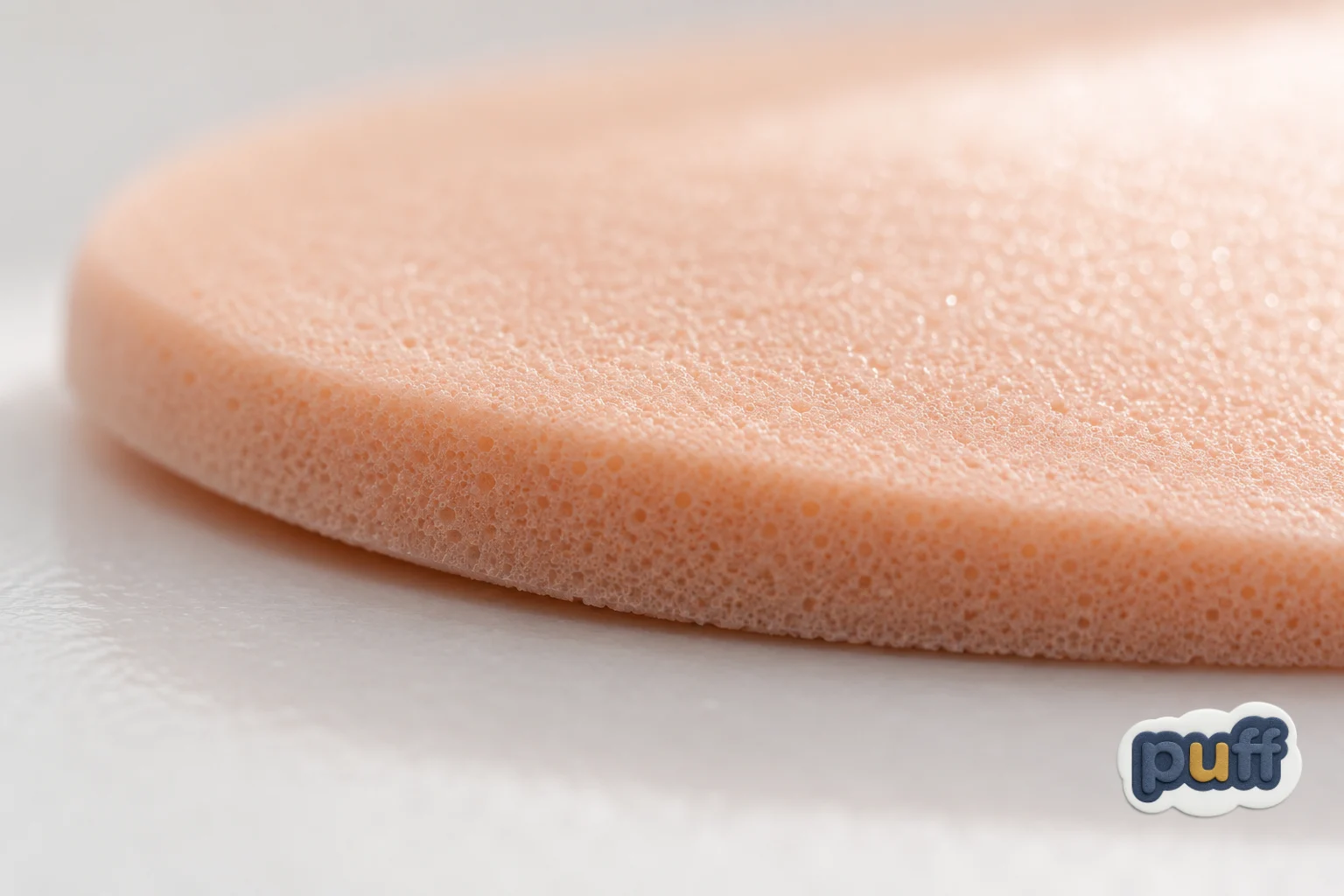
The second signal is the slow highlight. Light behaves differently on soft and hard surfaces. On a hard, polished surface, a highlight is small, bright, and sharp, a pinpoint of glare you could almost cut yourself on. On a soft, slightly textured surface, the highlight spreads out and fades gently at its edges. It glows instead of flashing. Foam, with its fine surface texture, tends to catch light in this broad, gentle way. The eye reads that soft glow as a sign that the surface underneath is soft too. It is a bit like the difference between a spotlight and a lamp with a linen shade.
The third signal is the promise of give. This one is harder to point at, because it lives more in suggestion than in any single detail. A foam sticker often looks as though it would compress if you pressed it, as if there were air or cushion inside. Sometimes you can see this in the slight unevenness of its height, or in the way its top surface is not perfectly flat but gently domed. The eye picks up on that looseness and reads it as a kind of openness to being touched. The object seems to say: go ahead, I'll move a little for you.
Put these three together and you get something close to a visual grammar of softness. The rounded shoulder tells the eye about the edges. The slow highlight tells it about the surface. The promise of give tells it about what lies beneath. A sticker that gets all three right can feel soft from across a room.
When the Eye and the Hand Agree
There is a quiet pleasure in having a guess confirmed. You see a peach on the counter, you pick it up, and it is exactly as soft as you expected. Nothing dramatic happens. Yet the moment feels right, like a key turning smoothly in a lock.
That feeling of rightness is one of the reasons foam stickers leave such a pleasant impression. When a person finally presses a finger to one, the touch usually matches what the eye predicted. The surface gives a little. The edge feels rounded, not sharp. The material is warm rather than cold. The brain's guess and the hand's report line up, and that agreement produces a small, calm satisfaction.
The opposite experience teaches us just as much. Most of us have reached for something that looked soft and found it hard. A cushion stuffed too tight. A fake fruit in a bowl. A "plush" toy that turned out to be stiff plastic under a thin coat of fuzz. The small jolt that follows is more than surprise. It feels a little like being let down. The object promised one thing and delivered another.
This gives us a useful way to think about any soft-looking object, including a sticker: call it honest softness. A thing has honest softness when its look and its feel tell the same story. A thing lacks it when the look promises comfort that the touch cannot keep. People forgive many things in small objects, but they remember that tiny moment of mismatch. It lingers longer than the object itself.
Honest softness is not about being as soft as possible. A sticker does not need to feel like a marshmallow. It just needs to feel the way it looks. A gently raised foam sticker that gives a little under the thumb keeps its promise. A sticker that looks pillowy but feels like hard plastic breaks it, even if it is otherwise well made.
Soft Depth and Its Neighbors
It helps to set foam beside the other ways a sticker can rise off a surface. Resin domes, for example, also add height, but they tell a very different story. A clear epoxy dome looks glassy and smooth, with a crisp, bright highlight and a firm, sealed edge. It looks finished, protected, precise. Foam feels warm, forgiving, and friendly. We explored that difference in depth in Soft Depth vs Smooth Depth, which compares the plush rise of puffy stickers with the polished rise of epoxy.
What is worth adding here is that the two finishes begin their work in the same place: the eye. Both epoxy and foam make a prediction before the hand arrives. The epoxy dome predicts hardness, smoothness, and a cool, glassy touch. Foam predicts give, warmth, and a gentle surface. Neither is better. Each one simply sets up a different expectation, and each one feels right when the touch confirms it.
This is a useful thing for anyone choosing a finish to remember. You are not only picking a texture. You are picking the promise the sticker makes to the eye, and then the feeling that keeps that promise.
Why Soft Things Are Having a Moment
Walk through any shop that sells small, cheerful objects and you will notice how much softness is on the shelves. Rounded phone cases. Squishy toys shaped like food. Puffy lettering on notebooks. Chunky, pillowy shapes in logos and illustrations. Even in digital design, buttons and icons have grown rounder and softer at the corners, as if the screen itself were trying to feel a little more kind.
There are many possible reasons for this, and no single one explains it all. Part of it is simple comfort. When daily life feels busy or sharp around the edges, people reach for things that feel gentle. Part of it is nostalgia, a pull toward the textures of childhood, including the raised stickers many of us once traded and hoarded. And part of it is a shift in how people want small objects to feel: less like tools, more like companions.
Foam stickers fit neatly into this mood. They are small, affordable, and easy to live with. They add a little warmth to hard surfaces like laptops, water bottles, planners, and phone cases. They soften the look of things that are otherwise cold and practical. In a world full of glass and metal and flat screens, a raised foam shape offers a tiny island of give.
What is striking is that much of this appeal happens at a distance. People buy soft-looking things online without ever touching them. They choose a squishy phone case from a photo. They add a foam sticker to their cart because it looks gentle on the screen. The eye's prediction of softness is strong enough to shape a decision on its own. The hand's confirmation comes later, when the package arrives, and that confirmation is what turns a good first impression into a lasting one.

What Makes Softness Read From a Distance
For anyone designing a foam sticker, the three quiet signals offer a practical guide. The goal is not to make the sticker as puffy as possible. The goal is to help the eye make the right prediction, so that the touch can confirm it.
Start with shape. Rounded, simple outlines carry softness better than spiky or highly detailed ones. A cloud, a heart, a rounded letter, or a gentle blob of a character will read as soft far more easily than a jagged star or a thin, detailed line drawing. That is partly because foam itself resists sharp corners. When a design asks foam to hold a fine point, the result can look strained. When a design follows the material's natural tendency to round off, the result looks relaxed and true.
Color plays a quiet role too. Pale, warm, and slightly muted tones tend to feel softer than bright, saturated, or very dark ones. This is not a rule so much as a tendency. A deep navy foam sticker can still read as soft if its shape and highlight do the work. But pastels, creams, and gentle earth tones give the eye an extra nudge in the soft direction.
Finish matters most of all. A matte or lightly textured top surface lets light spread out into that slow, gentle highlight. A high-gloss coating, by contrast, can pull the sticker toward a harder, shinier look, working against the foam underneath. When the goal is softness, the surface should let light rest on it rather than bounce off it.
Size and placement play their part as well. A foam sticker set on a hard, flat surface, like a laptop lid or a glass jar, gains extra softness by contrast. The eye reads the difference between the cold background and the warm, raised shape, and that difference sharpens the effect. A soft thing always looks softest next to something that isn't.
Here the material itself deserves a mention. Many foam stickers made from soft-touch EVA have a plush-like texture that matches the soft look people expect. EVA is the same family of foam you find in flip-flop soles and yoga mats, materials chosen because they give under pressure and spring back. On a sticker, that gentle give is what keeps the promise the eye has already made. For a broader look at how raised stickers are built and layered, the Complete Guide to Custom Puffy Stickers walks through the process from design to finished piece.
Showing Softness Through a Screen
A growing share of first impressions now happen through a photo, and a photo cannot be touched. That makes the three quiet signals even more important, because they are the only way softness can travel through glass and pixels to reach a customer.
Light is the biggest lever. A photo taken under harsh, direct light, like a bare bulb or midday sun, tends to flatten a foam sticker and give it hard, bright spots that look more like plastic than foam. Soft, indirect light does the opposite. Window light on a cloudy day, or a lamp bounced off a white wall, lets the highlight spread across the top of the sticker in that slow, gentle glow. The foam looks like foam.
Angle comes next. A photo taken straight down from above hides the very thing that makes foam special, its height and its rounded shoulder. A low, slightly sideways angle shows the edge curving down to meet the surface, and that curve is what tells the viewer the sticker is soft. A few degrees of tilt can do more for a product photo than any filter.
Context finishes the picture. Placing a foam sticker next to something soft and familiar, a knitted sleeve, a linen napkin, a folded wool blanket, gives the eye a helpful point of comparison. Placing it on something hard, like a steel water bottle or a glass jar, lets the contrast do the talking. Either way, the viewer's brain has more to work with, and its prediction becomes clearer and more confident.
None of this is trickery. It is the photographic version of honest softness: showing the sticker in a way that helps the eye guess correctly, so that the hand, when it finally arrives, finds exactly what it was promised. The best product photo of a soft thing is the one that makes the unboxing feel familiar, as if the customer had already held it once before.
This is also where custom foam stickers earn a quiet advantage over flat ones. A flat print looks much the same in any light. A foam sticker changes with every shift of the sun across a desk, casting a tiny shadow in the morning and a softer one at dusk. That small, living quality is hard to capture in words, and easy to capture in a well-lit photo.
Softness as a Quiet Brand Signal
For a small business, this has a gentle but useful lesson. The first impression a customer forms of a brand's sticker, label, or packaging often happens before they touch it, sometimes before it even reaches them. A photo in an online shop, a sticker on a friend's laptop, a label seen across a table at a market. In each case, the eye is making a prediction about how the object will feel, and that prediction carries a message about the brand.
A soft, rounded foam sticker says something different from a thin, glossy one. It suggests warmth, approachability, and a bit of play. It feels like a brand that wants to be liked, not just noticed. That can be exactly right for a café, a children's shop, a candle maker, a stationery brand, or anyone whose product lives close to comfort and everyday joy. It might be less right for a brand that wants to feel sharp, technical, or severe.
The important thing is fit. A brand that looks soft and delivers softness builds a kind of quiet trust. The customer sees the sticker, guesses how it will feel, touches it, and finds the guess was right. That small moment of agreement, repeated across many customers and many touches, becomes part of how people remember the brand. It is honest softness, carried from a single sticker to the whole relationship.
The Guess Before the Touch

Go back to the child at the kitchen table, pointing at the blue foam cloud. She was right, of course. When she finally peeled it off and pressed it to the cover of her notebook, it felt the way it looked: a little squishy, a little warm, a little bit alive under her thumb. She smiled the small smile of someone whose world had just made sense.
That smile holds the whole idea. We tend to think of touch as the sense that tells us what things are really like, and sight as the sense that only shows us their surface. But with soft things, the order runs the other way. The eye makes the promise. The hand comes along afterward to see whether the promise was kept. Much of the joy of a soft object lives in that short gap between seeing and feeling, in the confident little guess we make before our skin has said a word.
Seen this way, a foam sticker is less a thing we touch than a small prediction we get to test. Every time the prediction comes true, the world feels a little more trustworthy, and a little more gentle. That is a lot to ask of an object the size of a coin. It manages anyway.