
Why Some Custom Stickers Feel Like Objects
Some custom stickers feel like objects, not images. Explore the psychology behind raised, dimensional stickers and why depth changes what we hold onto.
Why Some Custom Stickers Feel Like Objects
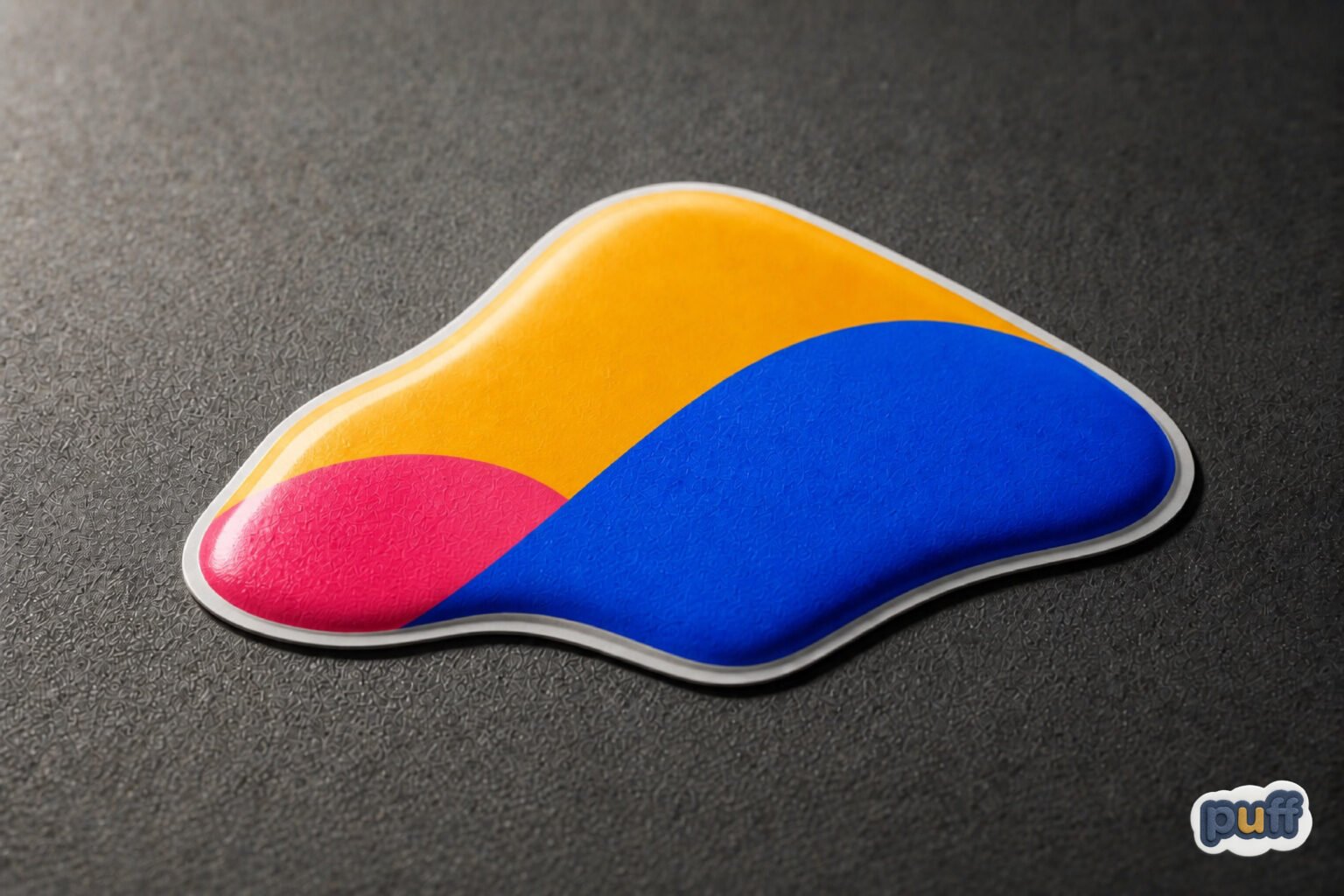
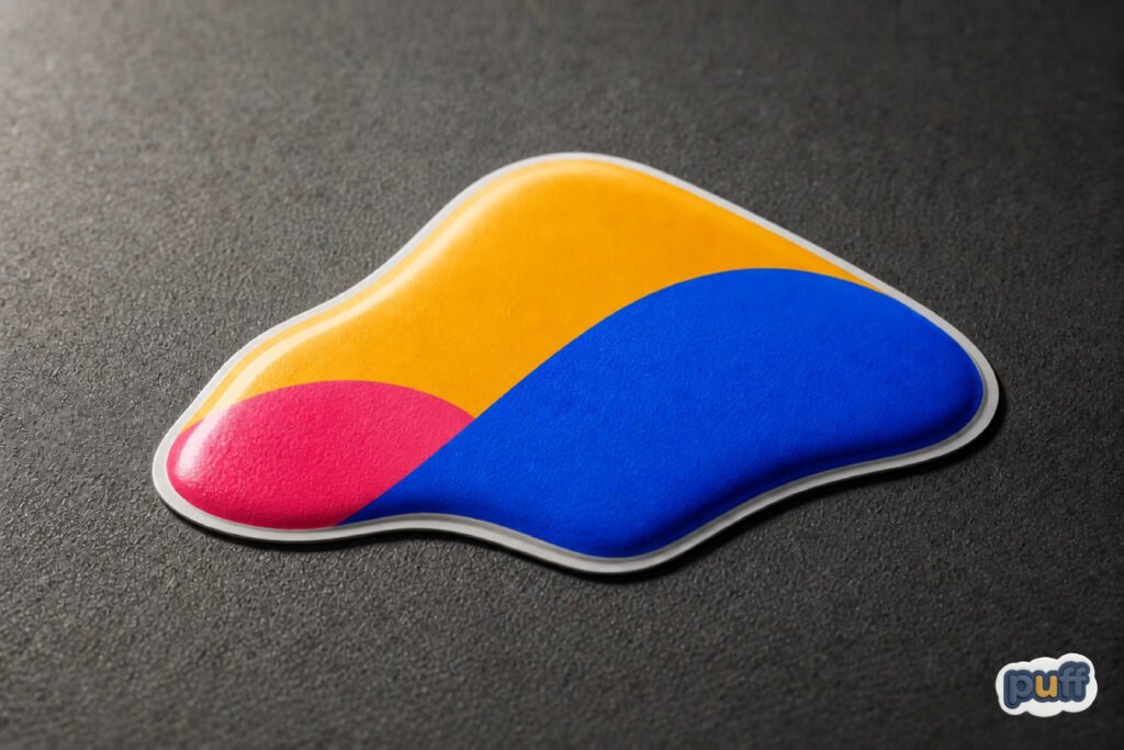
A sticker outlives its adhesive. Pull one off a water bottle a year later, after commutes and dishwasher steam and a hundred small collisions with a car door, and it comes away in a curl, not a scrap. The edges stay clean. The color has faded evenly, like a stone worn by a river rather than a photograph left in the sun. Something about it still resists being called a picture.
Run a thumb across the surface before it comes off and the resistance shows up sooner. A raised outline, a slight give at the center, a border that catches on a fingernail the way a coin catches on a countertop. None of that is decoration. It is architecture, built at a scale small enough to sit on a laptop lid and still register as a shape a hand can read before the eye finishes looking.
That distinction, between something printed and something built, is where this piece lives. Most conversations about stickers start with design: the logo, the color palette, the placement. Fewer start with the question underneath all of that, which is why certain small printed objects stop behaving like flat pictures and start behaving like things a person owns.
Children understand this before they have language for it. Hand a toddler two versions of the same cartoon character, one flat and glossy, one raised and squeezable, and watch which one gets carried around the house for the rest of the afternoon. The flat version gets looked at. The raised one gets held. Adults lose some of that transparency about what they want from an object, but the underlying preference rarely disappears. It just moves into laptop lids, phone cases, and water bottles instead of toy chests.
The Line Between an Image and a Thing
A flat printed label communicates information. It tells a viewer what something is, in the way a road sign tells a driver what is ahead. The eye takes the message and moves on. Nothing about a flat surface asks to be touched, because nothing about it promises a different experience at the fingertip than at the eye.
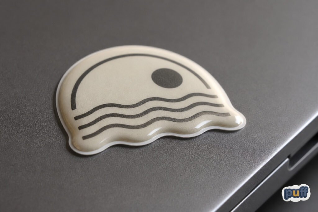
A raised surface changes the contract. Once a sticker has a profile, a place where light breaks instead of sliding across evenly, it starts issuing a second signal alongside the printed one. Call it a surface signal: a shape’s way of announcing, before any conscious inspection, that it occupies volume rather than simply covering an area. The eye registers this signal from several feet away, the way it recognizes a pebble on a table from a photograph of a pebble on a table, without needing to touch either one to know which is real.
This is not a claim that dimension makes a sticker better. Plenty of the most effective flat designs on the market work precisely because they stay quiet, because a clean vinyl surface reads as controlled and professional in a way a puffed-up label sometimes does not. A law firm’s window decal and a children’s brand’s water bottle sticker are not competing for the same reaction, and dimension serves one far better than the other. The claim is narrower: dimension changes the category a viewer files the object into. A flat sticker is filed with images. A raised one is filed with things, closer in the mind’s sorting system to a coin, a button, or a small tool than to a printed page.
Manufacturers have understood some version of this for longer than marketing language has existed to describe it. Wax seals, embossed letterhead, coin edging, the raised lettering on a leather wallet: all of it works from the same instinct, that a mark gains authority when it costs the maker something extra to produce and gives the owner something extra to feel. A monarch’s seal pressed into wax was never meant to be read quickly. It was meant to be felt, turned in the hand, recognized by its weight and its edge as much as by its image. A custom sticker with a raised surface inherits that lineage whether or not the person applying it to a laptop knows the history.
The same instinct shows up in currency design, where a slightly raised numeral or a texture strip exists partly so a person can identify value without needing full light or full attention. Object recognition through touch is old technology, older than print, and every dimensional sticker borrows a little of it whether the designer intended to or not.
The pin, the patch, and the varsity letter belong to the same family. None of them were ever meant to be read at a glance the way a printed slogan is. A patch sewn onto a jacket announces itself through its raised stitching as much as through its imagery, and the person wearing it usually knows exactly where the thread sits thicker under a fingertip, the same way a driver knows where a familiar gear shift sits without looking down. A dimensional sticker on a laptop or bottle occupies that same lineage of small, worn, personally located badges, shrunk down and reproduced at a fraction of the cost, but carrying the same basic promise: this marks something as mine, and it does so through more than color alone.
That is worth pausing on, because it explains why dimensional stickers cluster so heavily around personal objects rather than shared ones. A shared object, a company laptop, a rented car, tends to stay flat, uncustomized, anonymous. A personal object almost always accumulates texture over time, whether through stickers, wear patterns, or both, because texture is how an object stops belonging to a category and starts belonging to a person. The raised sticker speeds up a process that would otherwise take years of ordinary use to produce on its own.
What the Hand Knows Before the Eye Does
Psychologists who study touch have a name for the sense that lets a hand identify an object without looking at it: haptic perception, the combined input of pressure, texture, temperature, and the position of joints and muscles as fingers move across a surface. It works fast enough that most people never notice it running. A hand can sort keys from coins in a pocket in under a second, using nothing but this channel.
What makes haptic perception relevant to a sticker on a bottle is not the sticker itself but what the hand expects before it arrives. Research on affordances, a term the psychologist James J. Gibson used to describe the action possibilities an object’s shape offers a perceiver, established that people read surfaces for what they invite before they consciously decide anything about them. A door handle affords pulling. A flat button affords pressing. A raised, rounded surface affords touching, the same reflexive way a smooth stone on a beach seems to ask to be picked up.
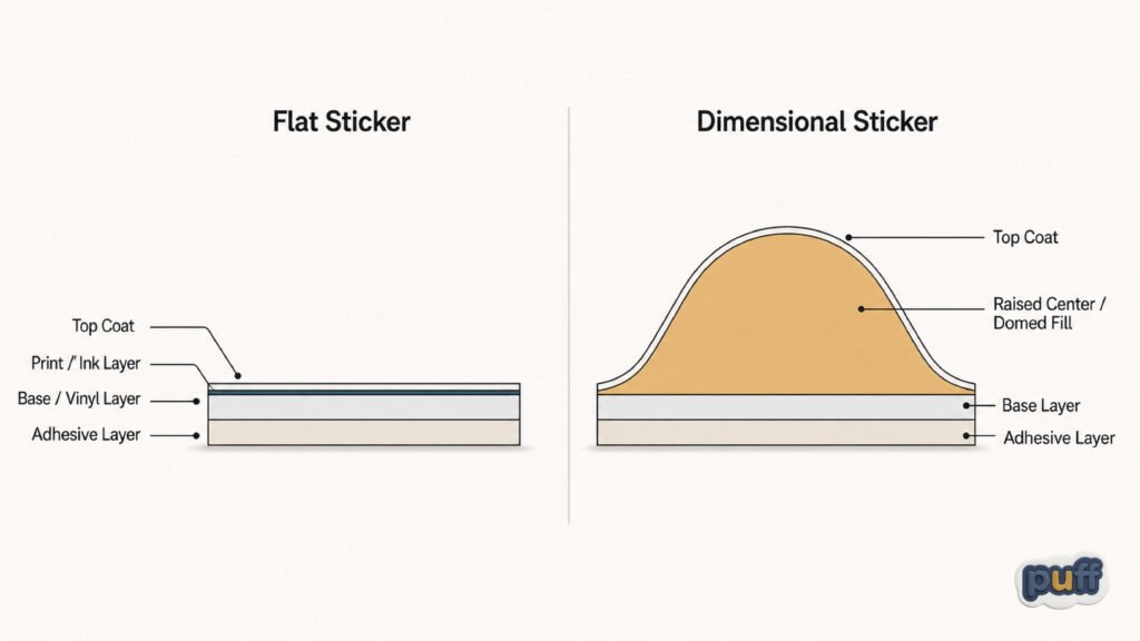
A dimensional sticker exploits this reflex without needing the viewer to think about it. The raised center of a puffy sticker or the domed surface of an epoxy label sends the same signal a rounded stone sends: here is something worth running a thumb across. That invitation happens before the viewer has processed the logo, the color, or the brand name printed on the surface. The physical form does its work first, and the message arrives inside a moment of attention the shape has already earned.
This is also why the same design, printed flat and then printed raised, reads as two different objects to the hand even when the eye sees near identical artwork. Take away the resistance and the give, and the mark becomes purely visual again, filed with the thousands of other flat images a person passes in a day. Put it back, even in a shape no larger than a coin, and the object claims a different kind of attention, the kind reserved for things rather than pictures of things.
There is a reason fidgeting so often involves something small and textured within reach, a pen cap, a coin, the corner of a sticker on a desk. The hand looks for surfaces that respond to it, and a raised sticker is one of the few printed objects built specifically to answer that search. A flat business card sitting in the same spot rarely gets touched twice. A dimensional sticker nearby often does, not because anyone decided to handle it but because the hand found something worth returning to.
Blind identification offers the clearest proof of how much of this happens outside conscious thought. Ask someone to find their house key on a ring without looking and most people manage it in a second or two, sorting by the small nicks and edges their hand has memorized without ever trying to. Give that same person a laptop covered in a mix of flat and raised stickers and ask them to identify one with their eyes closed, and the raised ones get named correctly far more often than the flat ones, even when the flat design is more distinctive to the eye. Texture, it turns out, is a better filing system for the hand than image ever was.
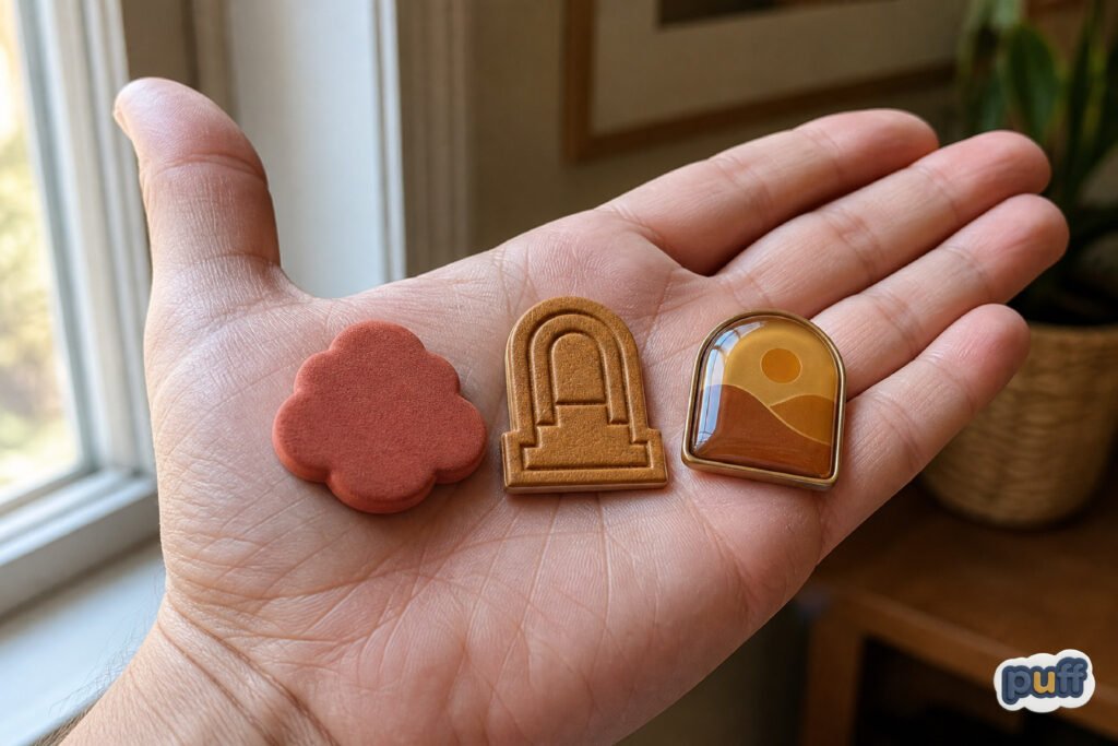
The Materials That Cross the Line
Not every material crosses from image to object the same way, and the differences are worth naming because they change what a raised surface promises a hand before it ever touches it. A soft, raised foam center, built from EVA material and finished with a plush-like texture, promises give. It compresses slightly under pressure and returns, the way a cushioned shoe sole returns, so the object reads as forgiving before the hand tests it. This is the texture most associated with play, with childhood, with anything meant to feel approachable rather than austere.
A leather-like feel built through convex elevation and structured multi-layer construction, the kind used in PU embossed printing, promises something closer to a wallet or a belt: quiet premium weight, a surface built to resist wear rather than yield to it. The raised areas sit lower and firmer than foam, closer to the feel of tooled leather than of a cushion, and the difference registers within the first half second of contact. A brand chasing a mature, understated register tends to gravitate here rather than toward anything softer.
A three-layer build, sticky backing under a vinyl sheet under a UV or resin top coat, is what gives a 3D label its raised, puffy surface and its particular kind of solidity, closer to a badge than to a toy. This construction sits in a middle register between the softness of foam and the hardness of a dome, which is part of why it shows up so often on products that want to feel established without feeling either playful or precious. It reads as a small piece of official hardware rather than as an ornament.
And a crystal-clear resin dome, the kind used on epoxy stickers and dome decals, promises glass before it promises anything else: a smooth, raised surface with the hard, glass-like finish that has made epoxy something close to the gold standard for a label meant to read as permanent rather than disposable. Run a finger across a dome decal and there is no give at all, only a hard curve, the same feeling a person gets from a smartphone screen or a car headlight. That hardness is the point. It tells the hand this object was built to survive weather, sunlight, and years of handling without softening or scuffing, and the promise checks out more often than not. Soft Depth vs Smooth Depth puts that same contrast, give against hardness, side by side.
None of these are interchangeable, even though a brief glance groups them all under one heading of “not flat.” A brand chasing warmth and approachability gains little from a glass-hard dome. A brand chasing permanence and precision gains little from a soft foam center that compresses under a fingertip. The material a designer chooses is already making a claim about what kind of object the finished sticker wants to be, long before the artwork enters the conversation. Readers who want the fuller picture of how gloss and matte finishes shape that same first impression, on flat surfaces as much as raised ones, will find it in the psychology of quiet surfaces.
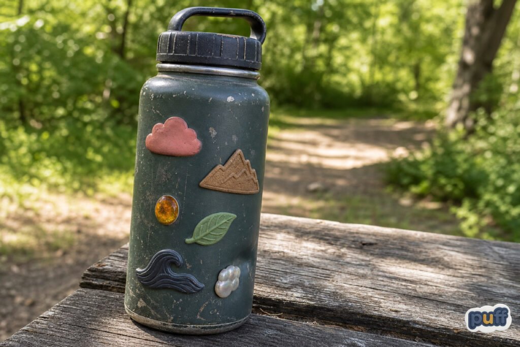
Where Objects Live: Laptops, Bottles, Boxes
The places a dimensional sticker ends up are rarely accidental, even when the person applying it has never thought about why. A laptop lid is a surface people touch dozens of times a day, opening and closing it, resting a palm near the trackpad, running a finger along the edge while thinking during a call. A sticker placed there gets guaranteed contact in a way a sticker placed on a wall never gets, and a raised surface rewards that contact instead of wasting it on flat silence. Watch anyone with a heavily stickered laptop for long enough and there is usually one sticker, often near the corner where the thumb naturally rests, that shows more wear than the rest. That is not damage. That is use.
A water bottle carries the same logic through a full day. It goes in a bag, gets picked up wet, gets set down on a desk and picked back up an hour later. Every one of those handling moments is a chance for a raised sticker to register as more than decoration, a small tactile checkpoint in an otherwise unremarkable object. People rarely choose a flat label alone when a dimensional option exists at a similar price, because the bottle is already a hand object, and a hand object deserves a hand-legible mark.
Notebooks and journals work a little differently, since the cover gets less continuous contact than a water bottle but more deliberate contact, the kind that happens when someone opens the cover with intention rather than in passing. A raised sticker on a journal cover tends to become a small ritual object, touched at the start and end of each entry the way a worry stone gets touched during a difficult phone call. The dimension gives the hand something to do while the mind is occupied elsewhere.
Phone cases sit at the opposite end of the handling spectrum from a journal. A phone gets picked up dozens, sometimes hundreds, of times a day, almost always by the same one or two fingers finding the same grip. A raised sticker placed near that grip stops being decoration within a week and becomes part of the physical vocabulary of holding the device, something the hand adjusts around without thought the way it adjusts around a chipped edge or a worn corner. Few objects a person owns get this much unconscious handling, which is part of why a phone case is often where the difference between a flat and a raised sticker becomes most obvious to the owner, even if they never articulate why one feels more like theirs than the other.
Packaging tells a slightly different story, closer to a handshake than to daily wear. The moment a box or bag with a raised label arrives, the recipient’s hand meets the brand before the eye finishes reading the copy. A flat label on that same box communicates efficiently and cheaply, which is exactly right for some products and entirely wrong for others. Where the unboxing moment matters, and where a company wants that first contact to carry weight, a raised surface does work a flat one structurally cannot: it turns the first touch into a small piece of evidence that someone built something rather than simply printed it. That single moment, a thumb catching on a raised edge before the box is even fully open, often does more for a brand’s perceived quality than the product photography that got the customer to order in the first place.
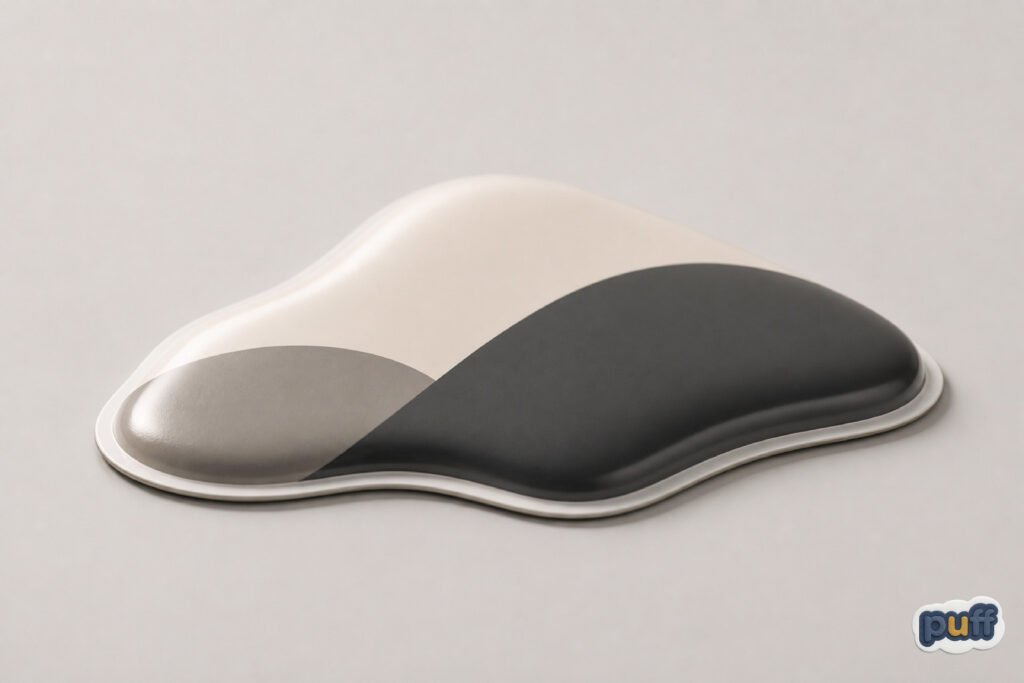
What a Brand Buys When It Buys Dimension
Businesses rarely describe the decision in these terms, but choosing a raised sticker over a flat one is, underneath the design conversation, a decision about which sense gets to vouch for the brand. A flat sticker asks the eye to do all the work of establishing credibility: clean lines, good color, sharp print. A dimensional one recruits the hand as a second witness, and a hand is harder to fool than an eye. Cheap materials feel cheap on contact in a way they can sometimes hide from a glance across a room, and expensive materials tend to announce themselves the same way, honestly and immediately.
This is part of why custom puffy stickers, built around a soft, raised foam center and a squishy texture, keep showing up on products aimed at a younger or more playful audience, where an object that invites touch matches the tone the brand already wants to set. The stickers work because the hand and the message agree with each other. A playful brand printed on a hard, flat, forgettable surface creates a small dissonance a customer may never name but will feel. The reverse dissonance exists too: a somber, minimalist brand wrapped in a bouncy, squeezable texture confuses the hand as much as the eye.
The business case rarely announces itself as psychology. It shows up instead as return customers, as unboxing videos that linger a beat longer on the label than on the product itself, as a sticker that survives a backpack for two years instead of peeling at the corner within a month. A raised surface tends to be more durable by construction, since the same layered build that creates the dimension also protects the print underneath it from direct abrasion. That means the physical argument for dimension and the practical argument for it end up pointing the same direction more often than either marketing or manufacturing teams usually admit.
There is also a pricing conversation buried inside this that most businesses only half articulate. A customer rarely says out loud that a raised sticker felt worth more than a flat one, but the sense of worth still gets built somewhere, and it gets built partly through the hand rather than only through the eye. Two objects can carry identical artwork and still leave the buyer with a different read on quality, simply because one gave the hand something to confirm and the other did not. That difference in perceived worth costs the maker a small amount at production and can return a much larger amount in how the finished object gets talked about, kept, and passed along.
What a brand buys, in the end, is not a sticker. It buys a small amount of certainty that whoever picks the object up gets a second confirmation, delivered through the hand, of whatever the eye already decided. For companies working with custom puffy stickers specifically, that certainty comes built into the material itself, in the soft give that makes the object feel less like a printed message and more like something that was actually made. No amount of clever copywriting produces that same confirmation, because copy only ever reaches the eye and the ear. Only the material reaches the hand.
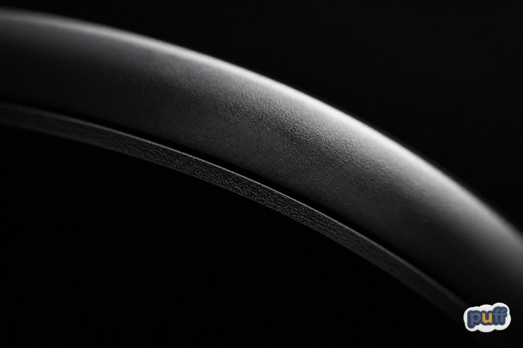
The Object That Outlasts the Image
Images fade from memory faster than objects do. A person can forget the exact color of a logo they saw a hundred times and still remember, years later, the specific give of a sticker they used to pick at during a boring meeting, the particular resistance of its edge under a thumbnail. The hand keeps records the eye discards, quietly and without effort, the way a habit outlasts the reason it started.
That asymmetry is the real argument for building a sticker with dimension instead of simply printing one. A flat mark competes for attention with every other flat mark a person sees in a day, an enormous and largely interchangeable field of logos, signs, and screens. A raised one competes in a much smaller category, the short list of small objects a hand has actually spent time with, and small categories are where things get remembered. Nobody keeps a mental inventory of every flat image they passed on a given afternoon. Most people could describe, without much effort, the last object that surprised their hand.
This is also why old stickers rarely get thrown away with the same ease as old flyers or old business cards. A flat printed thing feels disposable because it never asked anything of the body, only of the eye, and the eye forgives easily. A raised one asked for a small physical relationship, however brief, and that relationship is harder to discard without a twinge of the same reluctance a person feels giving away a well-worn object rather than a clean, unused one. The sticker earned its place the way a thing earns a place, not the way an image earns a glance.
Somewhere between the printing press and the pocket, a sticker either stays a picture or becomes a thing. The materials decide which, long before the artwork does. What lingers afterward, on a laptop lid or a water bottle years past the point anyone still reads the words on it, is never the message. It is the shape the thumb still remembers finding there.