Some materials don’t wait to be understood. They are felt first, processed later.
Foil stickers belong to that category. Before someone reads the text, before they notice the shape, before they even decide whether they like the design, something else happens. The surface catches light, shifts slightly, and the brain registers it as different.
That difference is subtle, but it’s immediate. And more importantly, it’s rarely neutral.
Foil doesn’t just decorate a design. It changes how the design is received.
The moment before thinking
Most visual decisions don’t begin with logic. They begin with reaction.
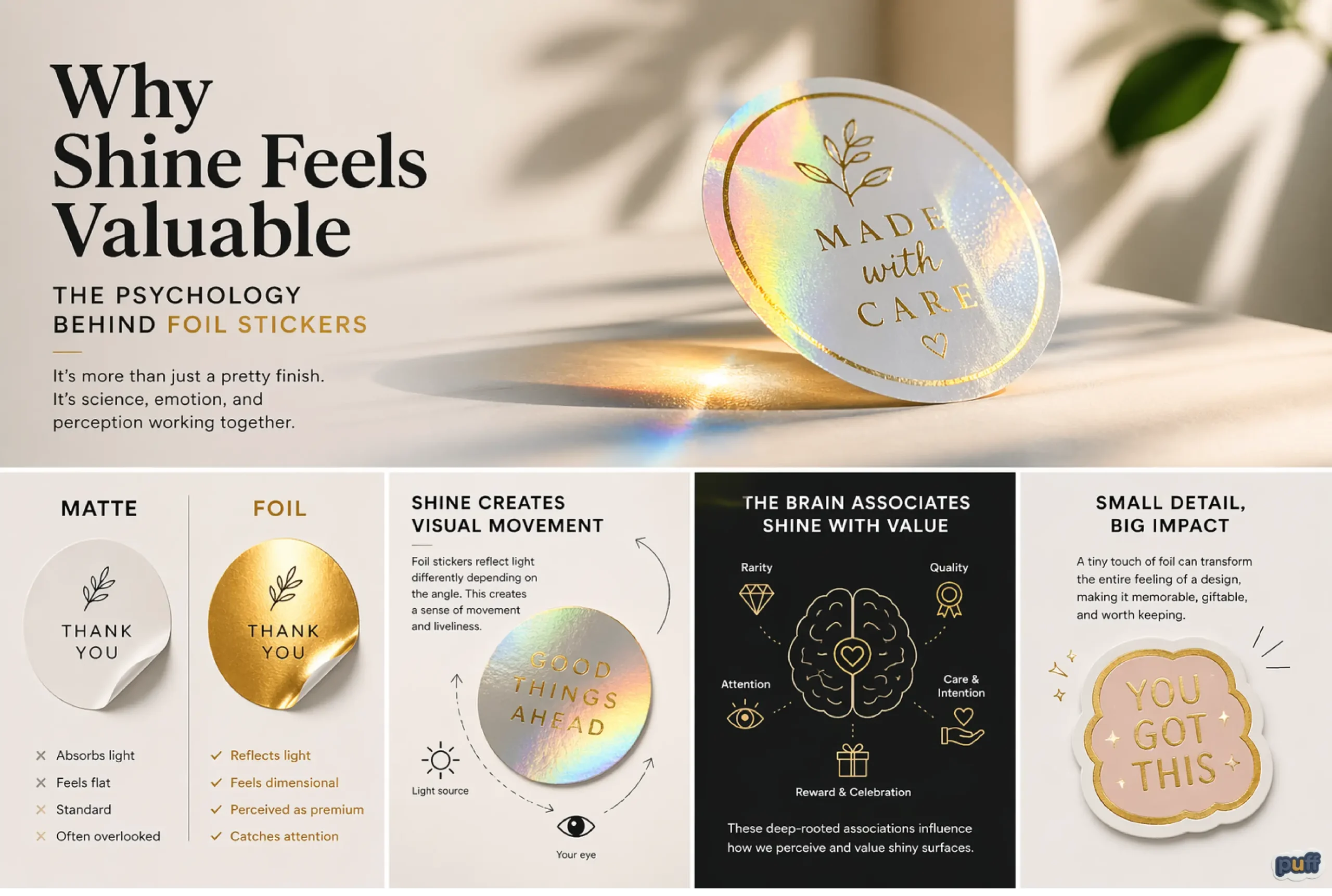
When someone looks at a surface, the brain doesn’t start by analyzing content. It scans for contrast, movement, and irregularity. These are signals that something might require attention. Foil works because it introduces all three at once.
A matte surface absorbs light. A standard printed sticker reflects it evenly. But foil behaves unpredictably. It bends light, shifts tone, and creates micro-variations depending on angle and environment.
That unpredictability matters.
It creates a moment where the brain pauses – not consciously, but just long enough to register: this is not ordinary. That pause is where perceived value starts forming, even before meaning is attached.

Slow down and shine. Our rose gold foil stickers add a touch of warmth and elegance to your daily essentials. Perfect for wellness and lifestyle branding.
Shine as a signal of intention
Not all surfaces feel designed. Some feel default.
Flat print often blends into expectation because it’s familiar. It’s what people assume a sticker will be. Foil disrupts that assumption. It signals that someone made an extra decision.
And intention is often mistaken for value.
When a viewer sees foil, they rarely think about the technical process behind it. They don’t think about stamping, layering, or material cost. Instead, they interpret it as care. As effort. As a deliberate enhancement.
Even a small custom metallic foil sticker can shift the perception of the entire piece. A thin border, a logo highlight, a single word in foil – these details feel considered. They suggest restraint and control rather than excess.
In many cases, that restraint feels more premium than complexity.
The illusion of movement
Foil doesn’t move, but it appears to.
As light changes, the surface reacts. It brightens, dims, sharpens, softens. This creates a sense of interaction between the object and its surroundings. The sticker no longer feels static. It feels responsive.
That responsiveness gives the impression of depth.
Even on a completely flat surface, foil introduces a layered feeling. It separates certain parts of the design from others, not through physical height, but through optical behavior. Some elements feel closer, others feel slightly recessed, simply because of how they catch light.
People are highly sensitive to these cues.
We are drawn to things that feel dimensional because dimension suggests construction. And construction suggests effort. When something looks like it has been built rather than simply printed, it often feels more valuable – even if the difference is purely visual.

Add some sparkle to your day with this ultra-cute holographic kitten! Perfect for those who love all things kawaii and glittery.
Memory is metallic
There is also a deeper layer to how we interpret shine.
Across cultures and time periods, reflective materials have rarely been neutral. Metal, glass, polished surfaces, ornaments – these have often been reserved for objects of importance. Tools, jewelry, ceremonial items, currency, gifts.
Because of that history, the brain doesn’t treat shine as just another finish. It treats it as a category.
Foil taps into that category without needing to explain itself.
When someone sees a metallic surface, they don’t consciously think of gold or silver objects from the past, but the association still exists at a low level. Shine feels intentional because it has rarely been accidental in human-made objects.
This is why foil can elevate even a minimal design. It borrows meaning from a long visual history of materials that were not common, not disposable, and not ignored.
Attention versus fatigue
There is a reason why not everything is made shiny.
Too much reflection creates noise. When everything competes for attention, nothing stands out. This is why foil works best in contrast. It needs something quieter around it.
A matte background makes foil feel sharper. A simple layout gives shine a place to exist without overwhelming the eye. When used selectively, foil becomes a focal point rather than a distraction.
This balance is important because attention has limits.
If a design constantly demands attention, it becomes tiring. But if it offers moments of attention – small flashes, subtle highlights – it feels engaging. Foil operates well in this space. It doesn’t need to dominate the entire design. It only needs to interrupt it at the right places.
That interruption is what keeps the surface interesting over time.

Diversity in design. Explore our range of specialty finishes including rose gold, matte gold, and holographic effects.
The difference between loud and precise
It’s easy to assume that adding shine automatically makes something bold.
But foil doesn’t always behave that way. In fact, some of the most effective uses of foil are quiet. A subtle metallic logo on a neutral surface can feel more refined than a fully reflective design.
This comes down to precision.
When foil is used with control, it feels like a decision. When it’s used everywhere, it starts to feel like decoration without direction. The brain picks up on that difference quickly.
People often associate value not just with what is added, but with what is held back.
A design that uses foil sparingly suggests confidence. It doesn’t need to prove itself through excess. It allows the material to speak in small, controlled moments. And those moments tend to feel more deliberate.
Shine and emotional framing
Foil doesn’t just affect how something looks. It affects how it feels.
A matte sticker might feel grounded, calm, or understated. A glossy one might feel clean and commercial. Foil introduces a different emotional layer. It can feel celebratory, marked, even slightly ceremonial.
This is why foil is often used in contexts that involve significance.
Packaging meant to be gifted. Labels that signal a limited edition. Event materials that mark an occasion. Even small branded elements that aim to feel memorable rather than disposable.
Shine creates a subtle sense that something has been elevated from the ordinary.
It doesn’t always scream luxury. Sometimes it simply suggests that this object belongs to a moment worth noticing.
The role of light in perception
One thing that makes foil different from other finishes is that it relies on the environment to complete the effect.
Without light, foil is just a surface. With light, it becomes dynamic.
This introduces a layer of unpredictability. The designer controls the placement of foil, but not how it will appear in every situation. The final look depends on angle, brightness, movement, and even the viewer’s position.
That lack of full control is part of the appeal.
Unlike flat print, which looks the same from every angle, foil changes. It rewards movement. It invites interaction, even if only through subtle shifts in perspective.
This makes the sticker feel less like a fixed image and more like an object that exists within a space.

Sometimes you just have a gold-foil kind of mood. Our textured gold stickers add a premium, expressive touch to laptops, water bottles, or journals.
Perceived value versus actual cost
What makes foil particularly interesting is the gap between production reality and perception.
In many cases, adding foil is not an extreme increase in cost. It is a process variation, not a complete transformation of the product. But the perceived difference can be significant.
This is because people don’t evaluate value purely based on manufacturing complexity. They respond to signals.
Foil is a strong signal.
It suggests that something extra has been added, even if that “extra” is minimal in terms of material. It reframes the object from something standard to something considered.
That shift in perception often matters more than the actual cost difference.
Why foil feels less disposable
Most stickers are, by nature, temporary. They are applied, removed, replaced.
Foil subtly challenges that idea.
Because it feels more deliberate, more finished, it often feels less disposable. People hesitate slightly before discarding something that looks refined. They treat it with a bit more care. They place it more intentionally.
This changes behavior.
A foil sticker is more likely to be kept, collected, or used in a context where it remains visible. Not because it is physically stronger, but because it carries a different emotional weight.
And that weight comes from perception, not function.

Deep thoughts, golden finish. Our textured gold foil stickers combine intricate line art with a premium tactile feel that demands attention.
The quiet power of surface
At a distance, a sticker is just a graphic. Up close, it becomes a material.
Foil operates in that second space. It’s not about what the design says, but how the surface behaves. It turns a flat message into something that interacts with light, space, and movement.
That interaction is what people respond to.
We are naturally drawn to things that shift slightly, reflect subtly, and resist being fully static. These qualities make an object feel more present. More real. More intentional.
Foil doesn’t need to be loud to achieve this.
It only needs to catch light in a way that makes someone pause, even briefly, and feel that this surface is doing more than expected.
The value is felt before it’s explained
When people describe foil stickers as premium, they are often trying to explain a feeling after it has already happened.
The shine, the movement, the association with rare materials, the sense of intention – all of these work together at a level that doesn’t require conscious analysis.
By the time someone thinks this looks high-end, the decision has already been made.
Foil doesn’t argue for value. It suggests it.
And in many cases, that suggestion is enough to change how the entire object is perceived.