A bag of coffee sits on the kitchen counter, and for a second before anyone touches it, the light catches the surface and slides across in a thin silver line, then disappears, then comes back when the bag shifts an inch. A paper bag doesn’t do this. Neither does a plastic one, not really. The material doing that little trick was built to survive in space, not a pantry, and now it spends its days protecting a few ounces of ground coffee. That’s one of the odder handoffs in packaging.
The material is called Mylar, though its real name, if you get technical, is BoPET: biaxially oriented polyethylene terephthalate. Nobody set out to make a coffee bag with it. It was built to be strong, stable, and reflective enough to matter in aerospace. That it ended up wrapping pet treats and bath salts says less about the material changing and more about how much trust it had already earned somewhere far less forgiving than a grocery aisle.
This guide follows that trail: where the film came from, why its shine seems to earn people’s trust before they’ve read a word, what the different finishes are actually saying, and what a business gets when it chooses a custom mylar bag over something else. Think of it less as a spec sheet and more as the story of a small, familiar object most of us have never stopped to really look at.
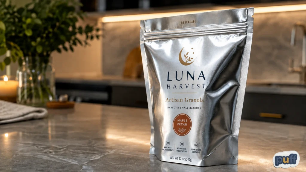
A branded metallic mylar stand-up pouch showing how reflective packaging creates a premium, eye-catching finish.
Built for the Vacuum, Landed on a Shelf
In 1964, a version of this film wrapped around a satellite. NASA’s Echo II, a 135-foot metallic balloon, used the same kind of polyester to bounce radio signals back down to earth, one of the first real proofs that a thin, metal-coated film could hold up at the edge of the atmosphere. Ten years before that, the film had already found its first job on the ground, as the backing for Eastman Kodak’s photographic film, chosen because it held its shape better than the plastics available at the time.
BoPET earned that reputation the hard way, through chemistry rather than design. During manufacturing, the film gets stretched in two directions at once, which locks its structure into something unusually strong and clear for how thin it is. Chemists at DuPont, Imperial Chemical Industries, and Hoechst each arrived at it separately through the 1950s. Once a very thin layer of metal gets added, the film turns reflective enough to bounce back almost all the light that hits it. That’s what made it useful for keeping astronauts warm. It’s also, almost by accident, what makes it good at keeping oxygen away from a bag of coffee.
Most people never learn any of this, and they don’t need to. What they’ve picked up instead is something looser, more like a memory. Mylar balloons showed up at birthday parties and parades for decades, so the shine already carries a feeling of celebration, of something a little futuristic and fun rather than functional. Someone who’s never heard the word BoPET still recognizes that finish, and part of what they’re recognizing comes from balloons, from the space blankets handed out at the end of a marathon, from a general sense that this kind of shine belongs to something engineered rather than just printed. Few packaging materials arrive with that much goodwill already built in.
(You can read more about the film’s structure and history on Wikipedia’s entry for BoPET.)
What actually moved this material from orbit and film stock into food packaging was the same trait that made it useful in space: once coated in metal, it becomes an excellent barrier against gas, moisture, and light. A film that helps keep a spacecraft stable can, on a much smaller scale, keep oxygen away from roasted beans or moisture away from a bath bomb. Nobody invented a new material for packaging. They borrowed one that had already proven itself somewhere far less forgiving than a store shelf.
Metallizing the film is a stranger process than most people picture. Aluminum gets vaporized inside a vacuum chamber and settles onto the moving polyester in a layer thinner than a soap bubble’s wall. That layer barely adds any strength; the polyester underneath still does the structural work. What the aluminum adds is the barrier itself, the thing that lets a strong, clear film hold a seal against gas and moisture for months. From there, manufacturers add a sealant layer, usually polyethylene, so the bag can be heat-sealed shut quickly on a packaging line. None of this happens in a design studio. It happens in a handful of specialized factories most of us will never think about, turning a material once reserved for aerospace into something ordinary enough to hold birdseed.
By the time barrier film had become its own packaging category, coffee roasters and supplement companies weren’t choosing it because it once orbited the planet. They were choosing it because nothing else, at a similar price, kept gas and moisture out as reliably, at the speed a packaging line needs. The space history became more of a footnote to a supply chain decision. It’s a footnote that still shapes how the material looks and feels today, though.
Worth clearing up: Mylar is technically a brand name, the way Kleenex became shorthand for tissue or Velcro for hook-and-loop fastener. The actual material is BoPET, and different companies make their own versions of it under different names. The word Mylar stuck anyway and now shows up on packaging specs no matter who actually made the film. People settled that argument long before the chemists got around to it.
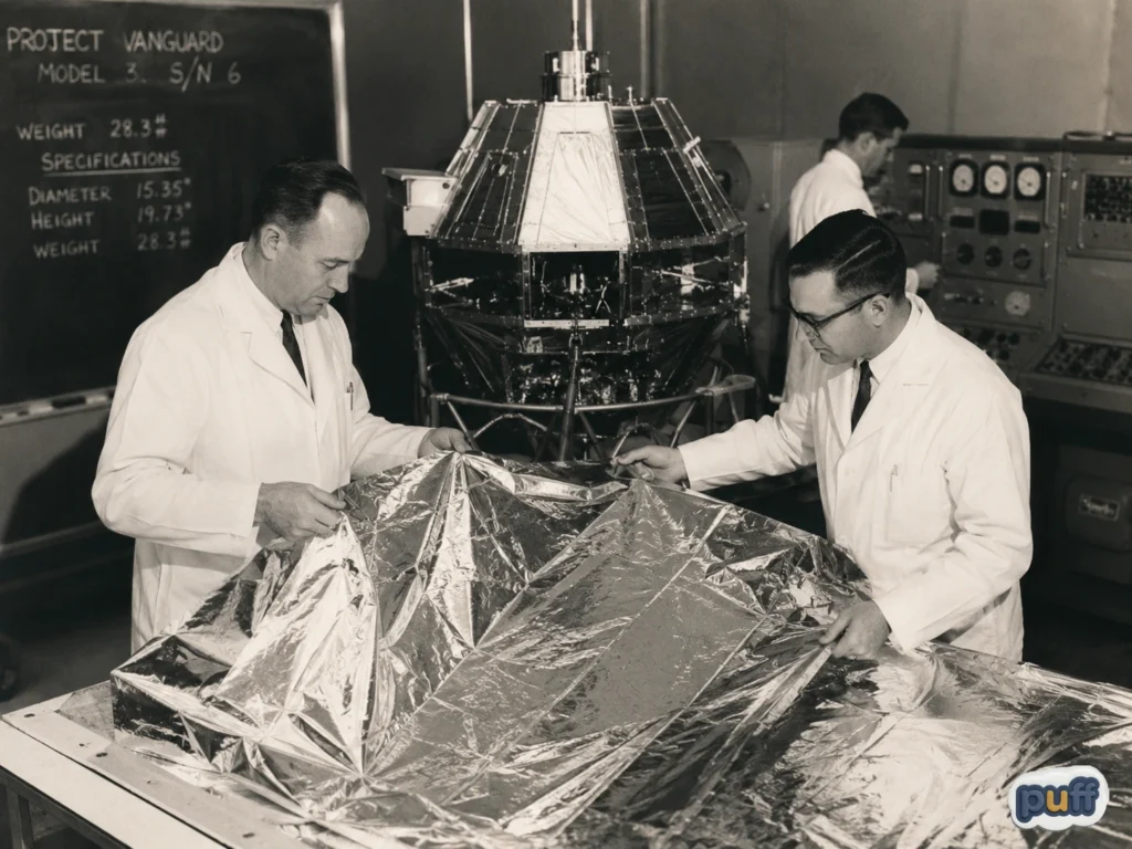
A vintage-style scene evoking the space-age technologies that helped make reflective polyester films widely recognizable.
Why a Shiny Bag Feels More Trustworthy
Put two bags of the same granola on a table, one in plain kraft paper, one in a shiny metallic pouch, and watch which one a stranger picks up first. Most of the time, a hand goes for the shine before anyone has read either label. Nobody taught them to do that. They just do.
The reason has less to do with the granola and more to do with what the eye is doing when it can’t check the thing that actually matters. You can’t see oxygen. You can’t see moisture working its way through a seam, or light slowly breaking down an oil over a few weeks on a shelf. All of that stays hidden, so the eye leans on something it can see instead, shine standing in for protection. A reflective surface feels sealed and careful in a way a matte or paper surface doesn’t, even when the two bags are protecting their contents just as well underneath. The shine isn’t tricking anyone, exactly. It’s just standing in for something that has no look of its own.
We’ve written before, elsewhere on this site, about how a mylar bag announces itself through sound before it’s even opened, that crinkle that reads as freshness the moment someone picks it up (see The Sound of Packaging). Shine does an earlier version of the same thing, working before touch even comes into it, just from across a room. Sound convinces you once the bag’s already in your hand. Shine gets your hand there in the first place.
Packaging teams treat that reflex less like a fixed rule and more like a dial they can turn. A brand aiming for something premium and precise leans into full metallic finishes, chrome or foil, a hard mirror shine borrowed straight from the material’s aerospace roots. A brand aiming for warmth mutes that same barrier film under a matte or kraft-look surface, keeping the protection but easing the shine down toward something closer to paper. Neither choice is more honest than the other. Both are just managing the same gap between what a package actually does and what someone can tell about it from a few feet away.
Store lighting makes this even stronger. Fluorescent and LED lights hit harder and more directly than the light in most kitchens, and a metallic bag under that kind of light can catch a shopper’s eye from several aisles over, almost like a small beacon. Some brands plan around this on purpose, putting their shiniest packaging where foot traffic moves fast and attention is thin. Nobody walking by ever notices they were nudged by light bouncing off a bag. They just remember reaching for the one that caught their eye, and give themselves the credit for the choice.
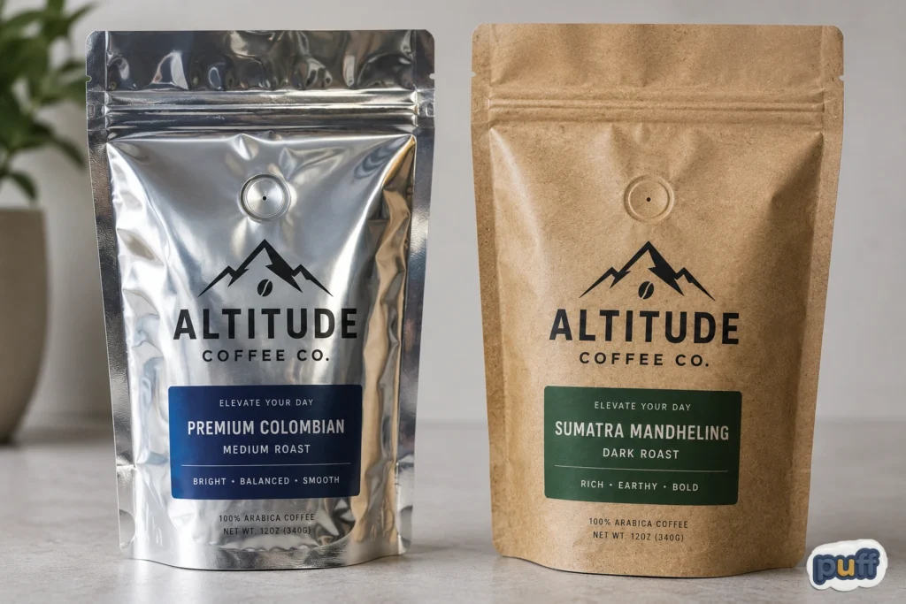
Glossy metallic and kraft-look custom pouches demonstrate how different finishes can completely change a brand’s packaging style.
Matte Kraft or Full Metallic: What the Finish Says
Walk down almost any specialty grocery aisle and this sorting happens without a single word of copy. Two bags of granola, same recipe, different finish, and a shopper’s hand drifts toward one before they’ve thought about why. The bag isn’t saying “premium” or “artisanal” out loud. It’s speaking in a kind of visual shorthand that most people learned to read long before they could name it.
Full metallic finishes, bright and cool, tend to feel technical and potent, almost lab-grade. Supplement brands lean into this often, borrowing that satellite-grade shine to suggest strength. Matte kraft finishes, warmer and closer to paper, feel more natural and small-batch, even though the barrier underneath might be doing the exact same job as its shinier cousin. A clear front window suggests honesty, useful for products where seeing what’s inside builds more trust than any claim on the label could. Frosted or matte white finishes borrow the look of clinical packaging, common in cosmetics, where cleanliness feels like proof that something works.
None of these are fixed rules. They shift by category and by audience, and a finish that feels premium in one aisle can feel cold in another. What stays the same is the basic mechanism: people read the finish before they read anything printed on it, and a business that picks a finish without thinking about what it’s saying is leaving that first impression up to chance. Choosing a mylar bag’s finish isn’t a step that comes after the branding work. It’s part of it.
A good way to test this before committing to a run is simple: hold a few finish samples next to each other under the lighting your product will actually sell under, whether that’s a bright grocery aisle, a softer boutique shelf, or a phone screen for an online store. What feels right in one setting can look completely different in another, and a few dollars spent on samples early is a lot cheaper than finding this out after thousands of bags are already printed.
There’s a second layer under all of this that most shoppers never notice: color. Metallized film starts out as a mirror, not a blank canvas, so printers usually lay down a layer of white ink first, so the colors printed over it look as bright as they would on paper. Skip that step, and colors take on a cooler, slightly see-through quality instead, which some brands choose on purpose for a look that feels more industrial than warm. A touch of gloss over an otherwise matte bag adds a third option, letting a logo catch light while the rest of the bag stays soft to the eye. None of this shows up as more than a line item on an order form. On a shelf, it’s doing most of the talking.
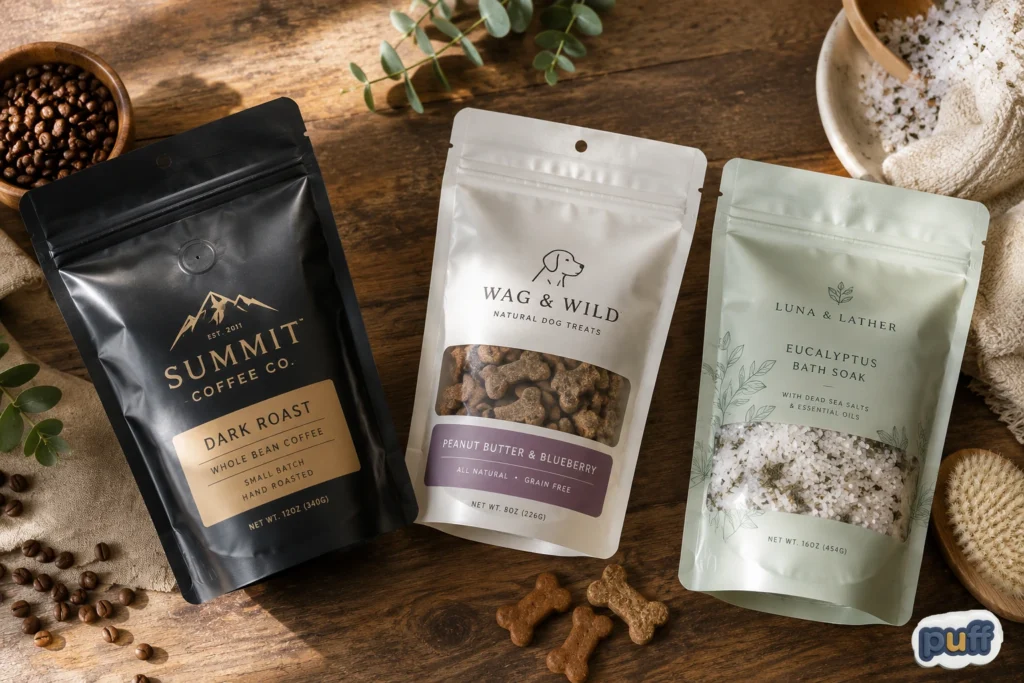
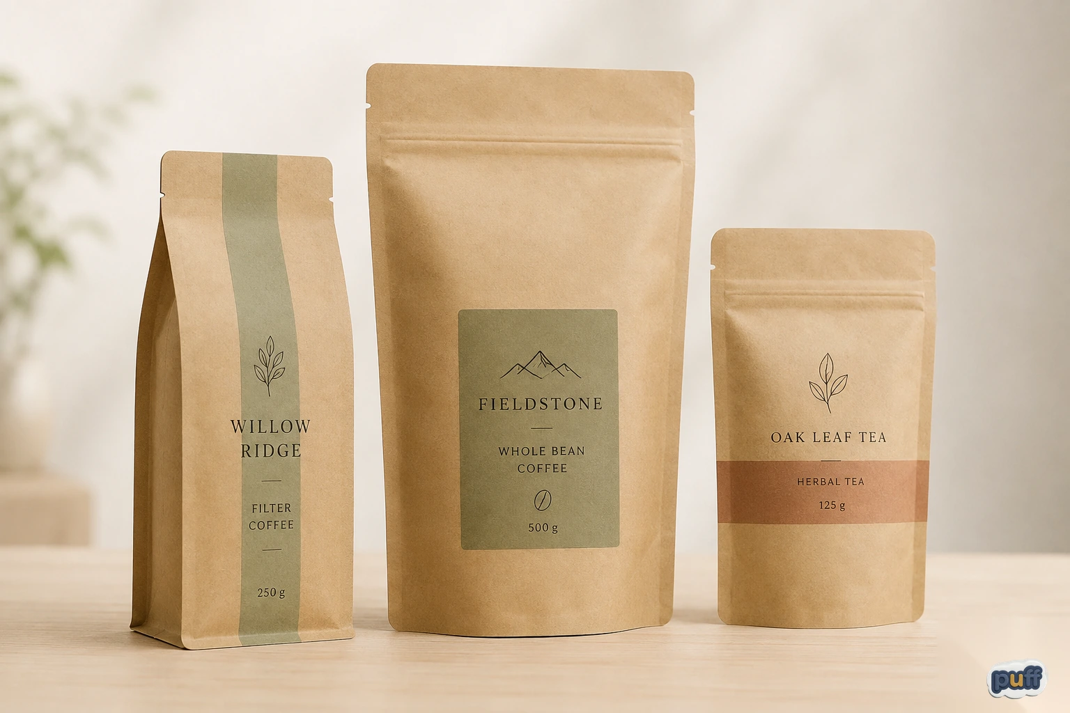
Custom flexible pouches can be adapted to products ranging from roasted coffee and pet treats to bath and cosmetic products.
Choosing and Customizing a Mylar Bag
Before a single bag goes into production, someone usually holds a proof up to the light and runs a thumb along the zipper, checking that it seals evenly all the way across. That small, unglamorous check catches what a screen never shows: a seam that puckers, a zipper that seals crooked, a valve sitting somewhere it might get crushed in shipping.
A custom mylar bag comes in a few basic shapes, and the choice matters more than most first-time buyers expect. Stand-up pouches, with a wider base that lets the bag hold its own shape, are popular in retail because they act as their own little display stand. Flat pouches and three-side-seal bags cost less and ship flatter, a fair trade for products that move through subscription boxes rather than sitting upright on a shelf. Coffee bags often add a one-way valve, which lets carbon dioxide escape after roasting without letting oxygen back in, a small detail that has nothing to do with looks and everything to do with the coffee still tasting fresh weeks later.
Printing adds another set of choices. Digital printing works well for shorter runs and frequent design changes. Rotogravure suits larger runs, where matching the exact same color across thousands of units matters more than flexibility. A soft-touch matte coating does something a screen can’t show you: it changes what a hand feels. Malcolm Keif and his colleagues, studying tactile coatings on cosmetic packaging, found that a soft-touch finish held its value in people’s eyes even at a higher price, while a glossy raised coating lost that same advantage once people actually picked the product up. Shine wins at a glance. Texture has to earn it once someone’s holding the bag.
PuffSticker’s own eco-friendly kraft mylar bags bring a lot of these decisions together already, for anyone who wants that warm, sustainable look without giving up performance: a strong barrier that blocks oxygen, moisture, and light, built on a recyclable mono-PE base or a certified compostable option, depending on the run. If everything above feels like a lot to weigh on your own, that’s usually the simplest way to see the trade-offs in front of you instead of in the abstract.
Size matters more than a lot of first-time buyers plan for. A bag that’s a bit too big for what’s inside looks half-empty on a shelf, which makes a shopper feel like they’re getting less than the label promises, even when the weight is exactly right. A bag that’s too tight fights the zipper every time someone tries to reseal it. Getting that balance right usually takes an actual sample in hand, not just a drawing on a screen, since a flat mockup can’t show how a bag really stands, settles, and holds once it’s filled.
Color is its own small headache, since printing over a shiny or metallic surface behaves differently than printing on paper. A color that looks right on an uncoated proof can shift once it’s printed on film. Good printers run a physical test on the real material before the full run starts, specifically to catch that kind of shift before thousands of bags come off the line in the wrong shade of a brand’s own color.
Timing tends to catch first-time buyers off guard more than any design decision does. Between an approved proof and finished stock, a custom run usually moves through plate setup, a physical sample for sign-off, and then the print run itself, a process that takes weeks rather than days. Planning for that early saves a business from the scramble that otherwise hits right before a launch, when there’s the least room to absorb it.
Sustainability deserves its own honest conversation, more than this guide can fully give it here. Recyclable mono-PE and certified compostable films are both real options, but they trade off against barrier performance and shelf life in ways that don’t always show up on a spec sheet, and the right answer depends on what a specific product actually needs to survive between the factory and someone’s kitchen. Anyone weighing that decision seriously deserves to treat it as its own question, not something tacked onto a finish choice.
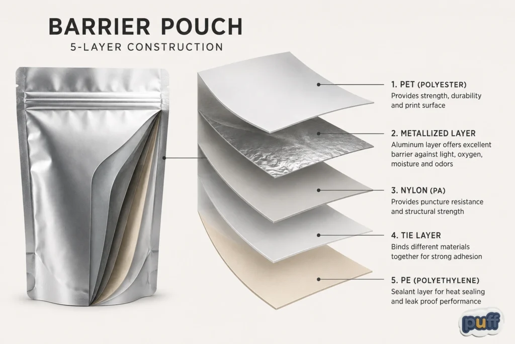
Barrier pouches combine multiple laminated films to provide strength, product protection, printability, and reliable heat sealing.
What a Bag Says Before Anyone Reads the Label
Somewhere right now, an unboxing video is paused on a package that’s still sealed, the product not even visible yet, and the opinion is already half formed. That pause is where packaging does its real work, in the gap between a box arriving and a box opening, before a single feature has had the chance to make its case.
Think about the last time you ordered from a small brand online and the package arrived looking a little cheap, thin, dull, the zipper not quite sealing right. It probably didn’t ruin the product for you. But it likely planted a small doubt before you’d even opened it, a doubt the product then had to work a bit harder to talk you out of. A well-made mylar bag doesn’t have to do that convincing work at all. It starts the relationship a step ahead instead of a step behind.
A custom mylar bag is, among other things, a line in a marketing budget most customers will never see broken out. The finish, the print quality, how cleanly a zipper seals, all of it adds up to a judgment a customer forms before reading anything, and that judgment shapes how generously they read everything after. Spending a little more on barrier film and finish rarely shows up as one big spike in sales. It shows up more quietly, in whether someone reorders without needing convincing, in whether a bag looks good enough to photograph and share without being asked, in whether a product feels worth its price before a single claim on the label gets read.
Small, independent brands are up against companies with packaging budgets they can’t match, but a mylar pouch closes that gap more than most materials can. The barrier and the shine both scale down to short runs without losing what makes them work, so a business ordering a few hundred units gets the same reflective, protective material a much bigger competitor uses, just at a size that fits their order. That’s a real advantage in categories where how something looks on a shelf decides more purchases than the ingredient list does.
It also carries across a whole product line, which matters more than any single bag could on its own. A brand selling five flavors of the same trail mix, or three strengths of the same supplement, relies on a consistent finish and print quality to say that all five belong to the same family, even from across a store. Customers learn a brand’s look the way they learn a friend’s handwriting, fast, and mostly without trying. A bag that looks or feels even a little different from one product to the next quietly chips away at that recognition every time it happens.
None of this asks a business to think like a chemist. It just asks them to notice that a customer’s first opinion usually forms before the product itself ever enters the picture, on the bag, in the light, in the half second before anyone reads a word.
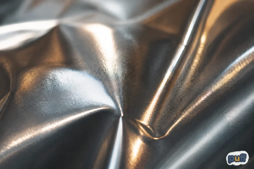
Light moving across metallic mylar creates the shifting highlights, depth, and visual texture associated with reflective packaging.
The Same Job, at Counter Height
Back on the counter, the coffee bag catches the light again as someone finally reaches for it, and that little arc sliding across its surface is doing, on a much smaller scale, exactly what an engineer once asked the same film to do above the atmosphere: hold a boundary, keep the inside stable, and do it quietly enough that almost nobody watching has to think about how.
That’s the real inheritance here. Not the shine, and not the barrier chemistry underneath it, but the fact that a material built for one of the harshest environments we’ve ever tried to survive now spends its days guarding something as ordinary as roasted beans or bath salts, and does it well enough that the only thing left to notice is a flash of light on a kitchen counter. A bag that used to orbit the planet just has to get through a pantry shelf now. It always had more than enough left in it for that.
Every custom mylar bag on every shelf is carrying that same quiet overqualification, whether or not the person buying it ever thinks to ask where the shine came from. Most won’t, and the material doesn’t need them to. It just keeps doing, at counter height, the same job it once did at the edge of the atmosphere: holding the line between what’s inside and everything that would rather get in.